Did not install thru update button, just created new usb. This works just fine. My thoughts on the new interface.
Usually I turn off all desktop icons anyway, so I like this new minimalistic approach.
Still too many icons on the tray. After playing around with it for a while, I started
rearranging icons a little bit, see screenshot. Off course this is tailored to my personal
taste/workflow, and I probably would modify it some more. Maybe putting the virtual desktop
switcher all the way to the front - not sure if this is possible, and I did not spend too
much time playing around with it.
The overall theme is a little bit hard on my eyes, I would go for something more neutral.
I also changed the height of the tray to 32, the original size was too small for me, and I
changed the icon set, since the default icons don't seem to have enough contrast to easily
recognize them. Using svg icons would probably improve the readability.
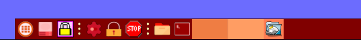
- screenshot-tray.png (14.03 KiB) Viewed 3215 times
Another thought I had was, maybe it would possible to have something similar to the "EasyApps"
window, where the user can place the program icons for the apps that are most used, see
below. This was just a quick mockup, to demonstrate what I mean.
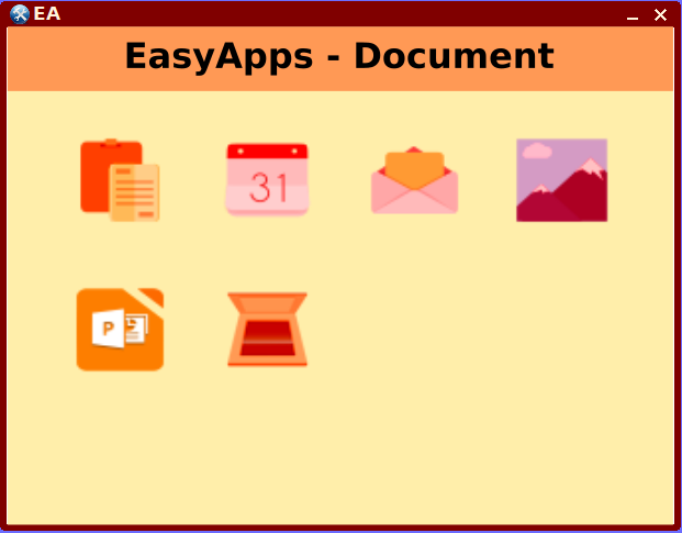
- mockup.png (33.92 KiB) Viewed 3215 times
Or just use "wbar" or "plank" for the favourite apps, which could be set to autohide so it
does not interfere with maximized application windows. This way the actual tray could be set
up to just hold the notifications and desktop switcher.
But overall I like the new concept, especially having quick access to containers and drives.
Accidently found the middle mouse-click for the drives and mouse-wheel for containers, nice.
Great work, thanks.

