12 character hexidecimal color format used by Roxfiler?

Issues and / or general discussion relating to Puppy

Moderator: Forum moderators

geo_c
Posts: 2877
Joined: Fri Jul 31, 2020 3:37 am
Has thanked: 2197 times
Been thanked: 871 times

Re: 12 character hexidecimal color format used by Roxfiler?

Post by geo_c »

JASpup wrote: Sun Dec 05, 2021 1:39 am

@geo_c you are beyond my experience but I appreciate being included. I would be interested in the GTK editor at some point. Still trying to figure out little things, like why builtin JWM themes have different fonts than we can choose in JWM Theme Maker. I.e., how could a theme use a font that is not installed?

I'm kind of just figuring out workarounds for my own way of changing themes, but I'm in way over my head. I'd have to look around, but I think there are a few places fonts are stored that aren't system fonts, but are specific to applications. I seem to remember they are located somewhere in /share.

JASpup wrote: Sun Dec 05, 2021 1:39 am

At the moment I would change just one thing -- solid color title bars instead of a gradient. I'm taking the active title bar and making the desktop its complement, maybe with slight adjustments (darker/greyer, etc).

The gradient thing is kind of what go me started on all this also. I'm not a fan of the gradient look. I like solid colors, and high contrast black. It just works better for my eyes.

The GTK theme builder I used from the PPM wasn't much different in settings than the one in JWMdesk. They might be the same basic application with a different interface. The JWMdesk version is easier to use, which is located on the button I pointed out earlier in this thread that gives the option of creating a matching GTK theme. But I suppose doing it that way would mean your tray, JWM titlebars, and GTK would have to be exactly the same.

JASpup wrote: Sun Dec 05, 2021 1:39 am

Remaining is the question of where sets are used, my Tahr remaster being a JQ8raised boot.
PMaterial is in the file managers and JQ8raised desktop/menus, but apparently at about 10 MB PMaterial still does not include the icons that change the Roxfiler row as Papirus did... or I missed something:
rox-tahr-pmaterial.png

There are different icons sets based off the same icon theme name, that aren't complete sets but specific to the task. And I'll have to track those down and get back to you on it.
geo_c
Old School Hipster, and Such

User avatar
JASpup
Posts: 1653
Joined: Sun Oct 04, 2020 10:52 am
Location: U.S.A.
Has thanked: 70 times
Been thanked: 89 times

Re: 12 character hexidecimal color format used by Roxfiler?

Post by JASpup »

@geo_c

The gradient thing is kind of what go me started on all this also. I'm not a fan of the gradient look. I like solid colors, and high contrast black. It just works better for my eyes.

Agreed though there's one exception for gradients I like:

You can't do it in JWM, but in XFCE you can gradient the desktop background as a setting (not a graphic).

It kind of looks like the classic Puppy green-blue background, which is similar to what I used in Slacko6 MATE:

Image

Lately in XFCE I've been doing a vertical black-white gradient. The caveat there is all desktop icons have to be on the same side or you can't see their text labels.

There are different icons sets based off the same icon theme name, that aren't complete sets but specific to the task.

There's probably enough in PMaterial to extract those icons for a much smaller menu/desktop set in the themes folder. I would just have to commit to one setup like your strong vision.

Before even thinking about my 64 machine, which is basically for Xenial JWM/XFCE, I'm still in 32 most of the time:

  • Tahr JWM for lightest weight / stability plus 1st-adoption familiarity & builtin VLC

  • X-Tahr for XFCE aesthetics and ease

  • Xenial JWM for compatibility

  • LxXenial because I can mount/unmount partitions in alt-file managers and quality icon sets are builtin

  • Hirsute +D XFCE because it's newer than X-Tahr, though less compatible than Xenial JWM

Alas this is too complicated for old machines of limited use. If X-Xenial existed my 32 arrangement would be like my 64.

If I tried to confine their use, I would probably have a simplier setup, but after a level of complexity it is not easy to limit what you intend to use a machine for.

On the Whiz-Neophyte Bridge
Linux Über Alles
Disclaimer: You may not be reading my words as posted.

User avatar
JASpup
Posts: 1653
Joined: Sun Oct 04, 2020 10:52 am
Location: U.S.A.
Has thanked: 70 times
Been thanked: 89 times

Re: 12 character hexidecimal color format used by Roxfiler?

Post by JASpup »

I just changed my GTK theme to Stardust and that changed my Roxfiler row to PMaterial.

Freak :shock:

Attachments
gtk-freak.png
gtk-freak.png (32.94 KiB) Viewed 1150 times

On the Whiz-Neophyte Bridge
Linux Über Alles
Disclaimer: You may not be reading my words as posted.

geo_c
Posts: 2877
Joined: Fri Jul 31, 2020 3:37 am
Has thanked: 2197 times
Been thanked: 871 times

Re: 12 character hexidecimal color format used by Roxfiler?

Post by geo_c »

JASpup wrote: Sun Dec 05, 2021 3:50 am

I just changed my GTK theme to Stardust and that changed my Roxfiler row to PMaterial.

Freak :shock:

Well yes. The first thing I did after tweaking the builtin Cayan-glass theme in jackalpup way back when, was download the cayan-glass theme for Fossapup proper and install it, then change the icon set to pmaterial. so I have pretty much been running that one theme for a year, and I have never been thrilled with the results I get by trying to change the GTK theme from that point on.

And as per your question earlier in the thread, in fact more to the main topic of the thread, when you asked if it was necessary to change the color values in the ROX options file to change the background color of the GTK windows, I seem to recall that they did in fact change the color. But then I went straight into editing the gtkrc and changing those colors also, so I can't say that I actually needed to change them in ROX options.

Which has me at this point wondering how JWM, GTK-2, and ROX really interact. My limited understanding is that JWM controls window title bars, start menu, and tray. But ROX itself has window management capabilities, can create panels and iconified windows, set it's own icons, etc. At the same time, when I change GTK-2 settings, as in theme elements, and background colors, ROX is interacting with those parameters. Just how that is all tied together is a bit of riddle for me.

geo_c
Old School Hipster, and Such

User avatar
JASpup
Posts: 1653
Joined: Sun Oct 04, 2020 10:52 am
Location: U.S.A.
Has thanked: 70 times
Been thanked: 89 times

Re: 12 character hexidecimal color format used by Roxfiler?

Post by JASpup »

geo_c wrote: Sun Dec 05, 2021 10:57 pm

Which has me at this point wondering how JWM, GTK-2, and ROX really interact.

No kidding.

I would look at Jackal someday and maybe someday too late for cameraderie but who knows.

The trick with GTK I find is matching, and fortunately there are enough 2.0 versions in the repository that options extend.

For my black/cyan boots there's a great set called Nodoka with a Midnight theme that fits. Where I found it in a later pup there were a few black themes. The only one I am really used to is NOX in X-Tahr which I had just settled on before finding Nodoka which displays nicely.

I am on a current kick of, instead of using newer pups, updating older ones to look like the new. I can sort of make X-Tahr look like Hirsute XFCE and with Pmaterial, Papirus, and Flat-Remix Tahr can look more like Fossa.

Other than features and curiosity another reason to boot these multiple distros is you stumble upon a setting that you want to use everywhere.

I have nothing on my desktop atm save the Trash icon and I think the Pop!_OS philosophy is a positive direction. My brain is cluttered and a blank desktop is easier on it.

I will probably seek repository themes when driven and keep to saving normal config files. When you do something like create a remaster without the Urxvt config, you manually change it about 20 times before you learn the file name (.Xdefaults) and bring it back by script, before you collect enough such changes to put them in an adrv or another remaster.

If I could fancy one distro I would be further along, but seeing what else is out there is too compelling.

On the Whiz-Neophyte Bridge
Linux Über Alles
Disclaimer: You may not be reading my words as posted.

User avatar
JASpup
Posts: 1653
Joined: Sun Oct 04, 2020 10:52 am
Location: U.S.A.
Has thanked: 70 times
Been thanked: 89 times

Re: 12 character hexidecimal color format used by Roxfiler?

Post by JASpup »

This is the LXDE/Openbox folder selection option:

LXDE_folders.png
LXDE_folders.png (9.4 KiB) Viewed 1116 times

as shown back here in JWM:
Image

This back JWM window is PCManFM with the LXDE folder option changed to "brown",
while the front window is Roxfiler (obviously same desktop) reflecting the PMaterial icon theme:

Lx-PCMan-vs-Rox-folders.png
Lx-PCMan-vs-Rox-folders.png (79.51 KiB) Viewed 1116 times

The gist is it takes the LXDE icon theme setting, whatever it is, to control the folder display in PCMan, even in JWM.

On the Whiz-Neophyte Bridge
Linux Über Alles
Disclaimer: You may not be reading my words as posted.

geo_c
Posts: 2877
Joined: Fri Jul 31, 2020 3:37 am
Has thanked: 2197 times
Been thanked: 871 times

Re: Transfered a theme from one pup to another.

Post by geo_c »

Well, I had done this before, but not in such a big way. I decided to migrate my customized theme from Jackalpup to Fossapup.

  • copied /usr/share/themes/cyan-glass/gtk-2.0 folder from jackal to fossa.

  • copied /usr/local/lib/X11/themes/geotheme-drk icon folder from jackal to fossa

  • copied jackalpup/usr/local/lib/X11/themes/geotheme-drk/midi desktop drive icons from to fossapup/usr/share/midi-icons/ folder

  • copied ~/.config/rox.sourceforge.net/MIME-icons folder from jackal to fossa

  • ran JWM Theme Maker to set menu/title-bar/tray colors and font in Fossa.

So I think that could all be done with a not so complicated script within the same operating system, within the same installed theme. In other words I would never have to actually change the GTK theme within the operating system, just keep the same theme, and switch out the gtk-2.0 folder and some icons. By using the method I shared earlier in this thread, keeping the themes in their own 'storage' folders, a script for each theme would just copy the proper files from the storage directory to the working theme directory.

Note that this customized theme has completely edited theme elements, scrollbars, buttons, tabs, etc, the whole cayan glass theme was re-done. So by storing the originals in there own storage folder, along with the original gtkrc file, etc, the themes can be user-switched without using the pup-theme switching tools.

In the above example I used JWM theme switcher, because I forgot where the file for that is, I think it's just sitting in /root. So I'll include that in the list of copied files once I test it.

Another Note that I copied the theme from Jackalpup remaster of Fossapup64, to a standard Fossapup64. So it's dubious as to whether this would work between some other versions of puppy. I'm guessing there would be issues.

A third Note is the fact that this is a manipulation of previously installed complete theme. So the fact that it works probably has something to do with other installed references and files within the system that make a properly installed theme go. I'm guessing (though I have yet to try) that if I just copied the theme folder and renamed it to something other than Cayan Glass, I wouldn't necessarily get the same results.

geo_c
Old School Hipster, and Such

geo_c
Posts: 2877
Joined: Fri Jul 31, 2020 3:37 am
Has thanked: 2197 times
Been thanked: 871 times

Re: 12 character hexidecimal color format used by Roxfiler?

Post by geo_c »

JASpup wrote: Mon Dec 06, 2021 2:47 pm

The gist is it takes the LXDE icon theme setting, whatever it is, to control the folder display in PCMan, even in JWM.

Well, that's a nice feature I think, if I understand what your saying. XFE for instance has it's own icon references, and I don't think there is any method in Fossapup to control it's icon set.

So the question is, can we get PCMan, XFE, ROX, and JWM to share an icon set. I don't think so, because looking at XFE icons, they seem to have very XFE specific names.

If one had the time to create symlinked icon files and directories for the different managers, I suppose switching an icon theme in one location could switch the icons in applications that are looking for their own MIME names that are linked to that location.

side note That Hirsute Hippo of yours looks nice, though my main thrust is the Utterly Black Background. One day I downloaded every available theme from the Fossapup PPM, and to my dismay, none of the dark ones were truly black, not even close. They are all dark grey. And from playing around with windows 10 at work, trying to use their "high contrast' settings, Apparently, black themes are not as cut and dry as they would seem. Any dark text or element that doesn't get reversed gets completely lost in the black. That's the challenge, but I'm so used to using completely black backgrounds and colored text, NOT WHITE, that it's hard for me to adjust back to anything else. I started by installing the Code Black firefox theme on Libre, and hard to find equivalent on Chromium, and I've never gone back. I want my computer to present the deep, dark, abyss of the HAL 9000, where after a pause, it responds with a line of green code:

Code: Select all

I'm afraid I can't do that, Dave

geo_c
Old School Hipster, and Such

User avatar
JASpup
Posts: 1653
Joined: Sun Oct 04, 2020 10:52 am
Location: U.S.A.
Has thanked: 70 times
Been thanked: 89 times

Re: 12 character hexidecimal color format used by Roxfiler?

Post by JASpup »

geo_c wrote: Tue Dec 07, 2021 1:27 am

Well, that's a nice feature I think, if I understand what your saying.

I was addressing a customization quirk, but it is good that it can be corrected at all.

XFE for instance has it's own icon references, and I don't think there is any method in Fossapup to control it's icon set.

So the question is, can we get PCMan, XFE, ROX, and JWM to share an icon set. I don't think so, because looking at XFE icons, they seem to have very XFE specific names.

I must confess 80% of the the time I use XFE it is to search. I'd be happy to get PCMan search working, so I do not think of it for visual customization nor have cosmetic problems with it unlike the other managers. The other 20% I just need a pane manager more compatible with JWM than the other two.

I think of PCMan and Thunar as twinsies with different hair styles. Mounting works in one, mounting works in the other. Icons display in one, icons display in the other (thus far in my experience).

Yes features and customization differ but the user-interface is similar.

I'm sort of evolving to the stage where I can selectively choose icon themes to avoid bloat. The Lx Xenial .iso if memory serves was only 15mb bigger than Mainline Xenial. That's a mere Pale Moon browser config today. Yet it has bountiful visual customization options that can be used in JWM.

side note That Hirsute Hippo of yours looks nice, though my main thrust is the Utterly Black Background. One day I downloaded every available theme from the Fossapup PPM, and to my dismay, none of the dark ones were truly black, not even close. They are all dark grey. And from playing around with windows 10 at work, trying to use their "high contrast' settings, Apparently, black themes are not as cut and dry as they would seem. Any dark text or element that doesn't get reversed gets completely lost in the black. That's the challenge, but I'm so used to using completely black backgrounds and colored text, NOT WHITE, that it's hard for me to adjust back to anything else. I started by installing the Code Black firefox theme on Libre, and hard to find equivalent on Chromium, and I've never gone back. I want my computer to present the deep, dark, abyss of the HAL 9000,

The best terminal background I find is usually all black.

In XFCE I experienced an unfortunate ability to control the icon text color.

I probably have preference swings where ONE of them is the black abyss.

In Lx it is coming to look like a Mallard duck theme. :lol:
Image

I mostly need something that does not look commerical (i.e., the default Windows 10 menu), lo-fi Atari 2600, or Philistine (art is uninteresting or uncomfortable).

On the Whiz-Neophyte Bridge
Linux Über Alles
Disclaimer: You may not be reading my words as posted.

geo_c
Posts: 2877
Joined: Fri Jul 31, 2020 3:37 am
Has thanked: 2197 times
Been thanked: 871 times

Re: 12 character hexidecimal color format used by Roxfiler?

Post by geo_c »

Hi @JASpup

After working a full 7 day week, I came home yesterday at 3pm and worked on themes for about 9 hours and came to some realizations:

  • Couldn't get a significant change in the GTK-3.2 font/base colors of my modified cayan-glass theme. Just couldn't get anything to change, though many of the changes that were made in the GTK-2.0 files of the theme altered the appearance of GTK-3.2, namely window borders, gradients, and colors.

  • Was able to construct a completely customized GTK-2 look by editing the theme elements of the cayan-glass theme as previously noted in this thread.

  • Then the big 'AHA! moment: I decided to go to https://www.gnome-look.org/p/1620049 and download a new GTK-3 theme. Found out it's a simple as unzipping into the /usr/share/themes/ directory and running JWMdesk>GTK Theme where the new theme will appear and be ready to go (this is on Fossapup64 of course which is GTK-2/3/3.2 ready and able.

  • Then the even bigger AHA! moment, when I decided to simply copy my customized GTK-2.0 folder into one of the newly installed themes. Thereby getting my GTK-2.0 custom theme combined with the new GTK-3/3.2 theme look. The result is my GTK-2.0 theme in GTK-2.0 applications, with the new GTK-3/3.2 theme in applications looking for it.

  • The end result is two themes with identical GTK-2 windows, and different GTK-3 windows that can be chosen from JWMdesk>GTK Theme

Rox responds accordingly, and I don't think changing ROX options is necessary. Also, the icon theme remains consistent when the GTK themes are switched.

A side note: One thing that has never worked for me is running the puppy utility called Theme-toggle. Every time I have ever tried it, the themes get messed up beyond repair and I have to revert to an earlier save. I have it installed, and I think I put it there if I remember correctly, but I'm not sure how that is supposed to work exactly.

geo_c
Old School Hipster, and Such

geo_c
Posts: 2877
Joined: Fri Jul 31, 2020 3:37 am
Has thanked: 2197 times
Been thanked: 871 times

Re: 12 character hexidecimal color format used by Roxfiler?

Post by geo_c »

@JASpup

Well now, this solves all my problems with matching GTK-3 to GTK-2. I just downloaded and installed this theme: https://www.opendesktop.org/p/1318110

And it is almost identical to my GTK-2.0 theme that I call 'geo-console.' The beauty of is if I want I can use this newly installed theme just for GTK-3.2 and copy my GTK-2.0 theme to complement it.

geo_c
Old School Hipster, and Such

User avatar
JASpup
Posts: 1653
Joined: Sun Oct 04, 2020 10:52 am
Location: U.S.A.
Has thanked: 70 times
Been thanked: 89 times

Re: 12 character hexidecimal color format used by Roxfiler?

Post by JASpup »

geo_c wrote: Sun Dec 12, 2021 8:32 pm

A side note: One thing that has never worked for me is running the puppy utility called Theme-toggle. Every time I have ever tried it, the themes get messed up beyond repair and I have to revert to an earlier save. I have it installed, and I think I put it there if I remember correctly, but I'm not sure how that is supposed to work exactly.

GTK can be an albatross but I see you've gotten really into it.

It's funny you've written back now as I am running a full-black desktop.

Menus are neon like an earlier thread post, but in XFCE now where GTK 2 is covered by Appearance and uniformity comes relatively easily.

I have to ask myself again why I boot one or the other. Tahr came first, then X-Tahr for ease of use, then Xenial for browsers, basically. I am running Chromium 90 in X-Tahr, so boot choice has become an odd whim. New can look a lot like the old without the overhead if you're willing to work on it. I don't need all this but it can be a bit addicting. There's that one little thing that compels you to boot a different distro before falling into the Customization Vortex. Sometimes it's The Sandcastle Game: Tahr becomes 64 Bionic before washing out to sea at shutdown.

I have not seen Theme-toggle, but I tried four menu managers today and I think I found one all the old hands would know about that works, PupMenuControl. The goal is to hide all the technical apps I rarely use (Task Manager and SysInfo are my gotos), rename half of them, and possibly add/rename categories and subcategories.

Yes I can do that manually, but I would rather an app where possible.

Pinboard can be easily changed by script, not only our desktop icons but background and all the drives, and that's a tempting setup I first heard about from Taersh. Learning how to do it myself is kind of coincidental correcting desktop problems. Put the script in a launcher and Black Theme is an instant selection.

X restarts when you change the Icon Layout, but it is not obvious why that is technically necessary to me yet. It's just the pinboard.

Icon control is still elusive but I'm learning. The blue folders are Papirus. Radient red were Flat-Remix. Hicolor I believe is supposed to match the desktop/menu Icon Theme, but it also subtlely updates the Puppy Standard set to the one I like. ROX I am still not sure about. Editing the .mine file is not the same as Roxfiler Options.

Gtk 3, where are those icons again? :lol:

Good luck with your Trinity theme. I use that Matrix background as my Xlock screen.

On the Whiz-Neophyte Bridge
Linux Über Alles
Disclaimer: You may not be reading my words as posted.

geo_c
Posts: 2877
Joined: Fri Jul 31, 2020 3:37 am
Has thanked: 2197 times
Been thanked: 871 times

Re: 12 character hexidecimal color format used by Roxfiler?

Post by geo_c »

JASpup wrote: Mon Dec 13, 2021 12:21 am

GTK can be an albatross but I see you've gotten really into it.
It's funny you've written back now as I am running a full-black desktop.

Menus are neon like an earlier thread post, but in XFCE now where GTK 2 is covered by Appearance and uniformity comes relatively easily.

Uniformity has been a huge learning curve when it comes to juggling JWM/GTK2&3, but at this point I'm kind of digging the flexibility. And I think that's where the icon thing comes in. What I've noticed in the past is switching the icons in JWMdesk for instance, all the menu icons change, but so do the desktop drive icons. My solution is to get the correct order, that is switch the menu icons and then drop my desktop drive icons into usr/share/midi-icons. An extra step, but then I'm not locked into using a unified set of icons, and I like that. That also goes for ROX and XFE icons, they are independent of the JWM scheme, and each other. That can be a plus for versatility, but requires mastering the learning curve.

JASpup wrote: Mon Dec 13, 2021 12:21 am

I have to ask myself again why I boot one or the other. Tahr came first, then X-Tahr for ease of use, then Xenial for browsers, basically. I am running Chromium 90 in X-Tahr, so boot choice has become an odd whim. New can look a lot like the old without the overhead if you're willing to work on it. I don't need all this but it can be a bit addicting. There's that one little thing that compels you to boot a different distro before falling into the Customization Vortex. Sometimes it's The Sandcastle Game: Tahr becomes 64 Bionic before washing out to sea at shutdown.

Well, I'm a compulsive system backer-upper. And too many puppy flavors make that even more of time suck. As of now I only use two different versions of Fossapup64, and I use Fossapup64 in place of Jackalpup for one of two reasons, either I'm on a machine with limited RAM, like my 2GB Toshiba with one CPU, or I'm doing several hours of private Zoom music lessons, and Jackalpup has tendency for Xwin to lock up every so often, maybe once every 5 hours, but still, it disrupts a lesson, so I use Fossapup which doesn't usually crash.

JASpup wrote: Mon Dec 13, 2021 12:21 am

I have not seen Theme-toggle, but I tried four menu managers today and I think I found one all the old hands would know about that works, PupMenuControl. The goal is to hide all the technical apps I rarely use (Task Manager and SysInfo are my gotos), rename half of them, and possibly add/rename categories and subcategories. Yes I can do that manually, but I would rather an app where possible.

Editing the start menu has always been a bit of an arduous task in puppy. It's definitely not like a windows drag and drop. I don't usually mess with the menu much. I have custom launchers both in Cairo and directories that I launch from my 'ROX faux panel strip.' And I have an actual ROX panel that I place launchers and window size/placement scripts in to get the maximum efficiency out of my workday. The menu I reserve for the heavy-lifting utilities and also apps I don't boot up very often. A good majority of my daily application launching involves portables, or commonly used system files, so about 25 launchers in a window on the desktop (doubled in Cairo-dock) get most of my start-ups covered.

JASpup wrote: Mon Dec 13, 2021 12:21 am

Pinboard can be easily changed by script, not only our desktop icons but background and all the drives, and that's a tempting setup I first heard about from Taersh. Learning how to do it myself is kind of coincidental correcting desktop problems. Put the script in a launcher and Black Theme is an instant selection. X restarts when you change the Icon Layout, but it is not obvious why that is technically necessary to me yet. It's just the pinboard.

That's what I was saying earlier in the thread about theme-switching scripts. Since I'm using a custom icon layout that is quite elaborate at this point. I have the icon directory in /X11/themes/ stuctured such a way that I can use the 'duplicate' option in ROX to copy whatever icon set I want in the active icon directory. That leaves my drive icons and menu icons untouched.

JASpup wrote: Mon Dec 13, 2021 12:21 am

Icon control is still elusive but I'm learning. The blue folders are Papirus. Radient red were Flat-Remix. Hicolor I believe is supposed to match the desktop/menu Icon Theme, but it also subtlely updates the Puppy Standard set to the one I like. ROX I am still not sure about. Editing the .mine file is not the same as Roxfiler Options.

Gtk 3, where are those icons again? :lol:

Good luck with your Trinity theme. I use that Matrix background as my Xlock screen.

GTK-3 icons are stored I believe in /usr/share/icons in gnome based desktops, just from my brief experience with downloading themes. But GTK-3 doesn't have icons per se in puppy, from what I can tell. In GTK-3 there are either image 'asset' folders in each theme for buttons, menubars, etc, or those elements are drawn by a script. As far as I can tell, GTK is not integrated into the overall icon scheme in JWM Puppy the way an XFCE desktop might be.

I just had great success with Trinity Theme. And I downloaded some other interesting looking GTK themes, so now I have lots of options. But Trinity is a nicely put together 'console' look. Like I mentioned, almost identical to the one I spent a week building. In the end I ran into only one problem with my GTK-2 dark console theme modified from cayan-glass, one being that a couple things I use several times a day, like GRsync change a checkbox option's text to black, and on a black-background the text is lost until moused-over and the 'pre-light' function kicks in. So you can see a checked box, but not what's been checked without mousing over. The other issue, and I believe this was always the case with cayan-glass straight out of the box, is that ROX doesn't show which file is currently active, so no box or pre-light on the selected file. That makes using the arrow keys for navigation impossible. The Trinity theme gives me the look of what I created, but fixes those two issues. However, I still like the way my theme looks better. Mainly because of framed buttons and tabs, which I find distracting. So I copied the entire Trinity theme and renamed it, which is easy and I didn't know one could do until I tried. Then I renamed the GTK-2.0 folder to GTK-2.0-ORIG and copied my custom build GTK-2.0 into the new theme. So the hybrid is quite wonderful. My GTK-2.0 windows, with Trinity's GTK-3.0 look, and they match up quite well. And, I still have my original Cayan-glass frankenstien, as well as the original complete Trinity theme to switch back and forth as I get bored. But ultimately, I tweaked the Trinity gtkrc which is a very simple file compared to others I was using, and substituted my green which is darker, and also changed the borders to black, so now my modified Trinity is the go-to. Fully functional and matching GTK2/3 windows. This theme should be easy to migrate just by copying the theme folder. I downloaded some other interesting stuff in the dark/black theme department:

https://www.gnome-look.org/find?search=validus
https://www.pling.com/p/1388140/
https://www.pling.com/p/1627601/
https://www.pling.com/p/1013065

geo_c
Old School Hipster, and Such

geo_c
Posts: 2877
Joined: Fri Jul 31, 2020 3:37 am
Has thanked: 2197 times
Been thanked: 871 times

Re: 12 character hexidecimal color format used by Roxfiler?

Post by geo_c »

I feel like the title of this thread should be changed or the thread broken off, because it becaume a pretty good discussion of theme manipulation in puppy.

geo_c
Old School Hipster, and Such

User avatar
JASpup
Posts: 1653
Joined: Sun Oct 04, 2020 10:52 am
Location: U.S.A.
Has thanked: 70 times
Been thanked: 89 times

Re: 12 character hexidecimal color format used by Roxfiler?

Post by JASpup »

PupMenuEditor is working well but finds me keeping this machine on until the project reaches a plateau. I've a ways to go, but my simplified Tahr menus at the moment look like this:

Desktop

tahr-jwm-desktop.png
tahr-jwm-desktop.png (71.25 KiB) Viewed 1154 times

System

tahr-jwm-system.png
tahr-jwm-system.png (48.34 KiB) Viewed 1154 times

Setup

tahr-jwm-setup.png
tahr-jwm-setup.png (88.7 KiB) Viewed 1143 times

If the app's name is as memorable as its function, it stays in, but normally the function is good enough.

Apps this boot are easily accessible 3 ways and I find myself using all three. It is like having three substitutable utensils on the table and reaching for the one that is most convenient, in this case:

  • Simplified menus

  • Find'n'Run

  • Desktop launcher folders

Folders are usually the fastest, but my inclination is to put them in a 2nd tray to keep the desktop clean.

Odd perhaps everything I come across seems to be gtk2 or not gtk so I have to learn more to understand your circumstances.

Tahr gtk3 in .config:

Code: Select all

[Settings]
gtk-theme-name = oxygen-gtk
gtk-fallback-icon-theme = gnome

As you discuss, where this is used is still a mystery. I do not come across these themes in config editors or as directories.

usr/share/midi-icons seems culled from the Icon Theme set. If I wanted different, I would probably use the right-click Set Icon... command for Roxfiler. Partition icons are usually o-kay to me. I don't like the Flattr drives.

One confusion: both drive icons and folders have the type (inode/directory), but different respective default icons display.

I backup a lot too. With The Sandcastle Game I was mostly expressing a lack of commitment. I like that I can make Tahr look like 64 Bionic, but I didn't make it a resting spot. Tahr both JWM/XFCE are back at Neon which is what struck me when I started.

I have been thinking about how the technical among us often are not motivated by aesthetics which tend to have a radical effect on my comfort and motivation. Once the desktop looks good I want to keep at it.

Interesting your crash experience, there are some utilities I can't use, like pkgs which crashes my system, but stability is also an underlying reason I still boot JWM. XFCE is stable but JWM is Puppy's home, so it is a little more predictable if not necessarily more reliable.

As a result without pkgs I do a lot of tedious cli petget. It works though I am surpised more users aren't in this same boat. I click Yes on petget install dialogs every day for the same packages and am not downloading much.

I was going to ask you about music, but maybe in another thread or im.

Editing the start menu has always been a bit of an arduous task in puppy. It's definitely not like a windows drag and drop.

Major Windows Advantage

Yeah, for JWM menus I either have to ignore them or change them, and I haven't done a good job of ignorance.

Funny, Cairo I first saw in a Studio puplet. It impresses me that you can get this going professionally. I do not consider any DAW setup lightweight in the simplicity sense.

DAW and printing are two top reasons Windows still matters to me, though I am not a musician. I need to be on computers, but most of the choice is in the hobby arena.

Today it was something seemingly mundane: Chromium can be set to open .pdf files, but not .doc(x)/.rtf apparently. I did not go extension searching, though a read format for text-based documents that is not Abiword or LibreWrite would be nice.

GTK-3 icons are stored I believe in /usr/share/icons in gnome based desktops, just from my brief experience with downloading themes. But GTK-3 doesn't have icons per se in puppy, from what I can tell. In GTK-3 there are either image 'asset' folders in each theme for buttons, menubars, etc, or those elements are drawn by a script. As far as I can tell, GTK is not integrated into the overall icon scheme in JWM Puppy the way an XFCE desktop might be

Lost but I will get it eventually.

I think with themes my goal is basic -- an attractive motivating desktop inline with Puppy's efficiency ethic.

If, say, Thunar is missing icons, I am not going to include a 25 MB icon set just to have them, even on my 8 GB machine. So how do I identify just the icons that are missing for suitable replacements? How to trim down a set without losing essential icons? And of course, if your goal is not to become a technician, are you going to do things a different way or become Kraftwerk.

On the subject of themes I do not see this discussion a problem, as it being my question.

The easiest way to change your Roxfiler colors is apparently a gtk2 theme, but if you want to get into it, we're providing that information.

On the Whiz-Neophyte Bridge
Linux Über Alles
Disclaimer: You may not be reading my words as posted.

geo_c
Posts: 2877
Joined: Fri Jul 31, 2020 3:37 am
Has thanked: 2197 times
Been thanked: 871 times

Re: 12 character hexidecimal color format used by Roxfiler?

Post by geo_c »

JASpup wrote: Wed Dec 15, 2021 2:40 am

Apps this boot are easily accessible 3 ways and I find myself using all three. It is like having three substitutable utensils on the table and reaching for the one that is most convenient, in this case:

  • Simplified menus

  • Find'n'Run

  • Desktop launcher folders

I'm very busy this season, but I would like to do some screen shots and gifs to demonstrate what I have going with the launchers. First off, I have a panel strip script from this thread: viewtopic.php?t=3839&start=100

williams2 wrote: Fri Sep 24, 2021 4:10 am

You can write a script to make a real rox panel appear and disappear on the right side of the screen when you press a shortcut key.

for example, you could create a script named charm, and drag the script to the pinboard (desktop) so you can execute it when you press the shortcut key, say Win+C

Code: Select all

#!/bin/sh
f=/tmp/flag
if test -f $f
then
  rox -r=
  rm -f $f
else
  rox -r charm
  touch $f
fi

So the rox "charm" panel will appear and disappear each time Win+C is pressed.

You can have different panels with different functions (different icons to click), of course.
You can drag applications to a rox panel the same way you would drag it to the pinboard.

If you don't like the idea of such a panel, some one else might like it. Or not.

So I've been using that panel quite prodigiously. But I recently decided to make the panel it's minimum size to accommodate my smaller displays, and it's great. The high contrast flat console green icon set is easy to see and the panel takes up 16 pixels on the side of my display. All of my go-to applications are located there.

What I've really been jazzed about since yesterday is using wmctrl to put a one icon sized ROX window on the desktop containing all my launchers, the directory I used to dedicate as a
faux panel strip
but now is used as a variable icon on the desktop. In other words the window looks like a single icon, but when active the arrow key scrolls through the launchers making it look like the icon just switches on the desktop. Scroll to the launcher, hit enter to open apps.

JASpup wrote: Wed Dec 15, 2021 2:40 am

Folders are usually the fastest, but my inclination is to put them in a 2nd tray to keep the desktop clean.

Odd perhaps everything I come across seems to be gtk2 or not gtk so I have to learn more to understand your circumstances.

Tahr gtk3 in .config:

Code: Select all

[Settings]
gtk-theme-name = oxygen-gtk
gtk-fallback-icon-theme = gnome

As you discuss, where this is used is still a mystery. I do not come across these themes in config editors or as directories.

These gtk icons I believe are used by many gtk applications, and appear in the menus. I don't pay much attention to them or bother to change them. I like LibreWolf and applications like it that don't put any icons in the menus. They fit my clean 'consoie' aesthetic.

JASpup wrote: Wed Dec 15, 2021 2:40 am

usr/share/midi-icons seems culled from the Icon Theme set. If I wanted different, I would probably use the right-click Set Icon... command for Roxfiler. Partition icons are usually o-kay to me. I don't like the Flattr drives.

One confusion: both drive icons and folders have the type (inode/directory), but different respective default icons display.

The desktop drive icons are in usr/share/midi-icons. But drive icons in other applications would be located in their respective themes. I use ROX and XFE, and those are perhaps the only applications displaying drive icons that would concern me. ROX is a custom set I culled from assigning manually, and XFE I'd like to change, but that's a resource intensive task that's not on my radar. I did some searches for alternate XFE themes, and they don't seem to exist. In ROX I display unmounted drives with a directory icon, and I made a special mount point directory icon to indicate it's mounted, which doesn't differentiate between a drive and say a mounted sfs.

JASpup wrote: Wed Dec 15, 2021 2:40 am

I backup a lot too. With The Sandcastle Game I was mostly expressing a lack of commitment. I like that I can make Tahr look like 64 Bionic, but I didn't make it a resting spot. Tahr both JWM/XFCE are back at Neon which is what struck me when I started.

My ROX icons apart from directories are basically bright colors for dark themes, a few are from neon sets, but there's no one set I can completely get behind. The Fancy-Dark mime-type icons are very classy and look great on black. I have a ROX set of those.

JASpup wrote: Wed Dec 15, 2021 2:40 am

I have been thinking about how the technical among us often are not motivated by aesthetics which tend to have a radical effect on my comfort and motivation. Once the desktop looks good I want to keep at it.

I've been evolving this desktop theme for a good 6 months now. Really it's been more like years. And the singular vision you often talk about probably comes from trying many things and always going back to something that works for me to look at for long periods of time. The concept refines itself. When I decided to cut over from a cyan type look to console green, it was a big change, and a bit of a gamble in terms of 'Am I really going to want to look at this for months or years?" Hard to say, but I'm pretty confident after a month or so that I'm going to stick with this idea, and when I get bored work on a couple of other colors and scripts to quickly switch. Or perhaps I could rotate between two or three save files with different color schemes. The work has gone into creating a structure and understanding the theme elements enough to make that possible.

JASpup wrote: Wed Dec 15, 2021 2:40 am

I was going to ask you about music, but maybe in another thread or im.

Today it was something seemingly mundane: Chromium can be set to open .pdf files, but not .doc(x)/.rtf apparently. I did not go extension searching, though a read format for text-based documents that is not Abiword or LibreWrite would be nice.

On the subject of themes I do not see this discussion a problem, as it being my question.

The easiest way to change your Roxfiler colors is apparently a gtk2 theme, but if you want to get into it, we're providing that information.

I'm busy with Christmas music this season. I'll be doing a lot of scoring in Musescore. I did some more work with Ardour. And I have a recording project I'm getting together in my head. So I'll be changing course from puppy themes to puppy music in 2022, the year when we all have flying cars.

LibreWolf is the best browser for opening pdf's and printing I have found. Chromium is a little more buggy with that.

geo_c
Old School Hipster, and Such

User avatar
JASpup
Posts: 1653
Joined: Sun Oct 04, 2020 10:52 am
Location: U.S.A.
Has thanked: 70 times
Been thanked: 89 times

Re: Desktop Color and Customizations

Post by JASpup »

@geo_c my experience is a ROX panel(/tray, using interchangably) is a very basic screen-long app bar. I've tried those but prefer the format of JWM 2nd trays.

You're 64-bit so old machines are probably not so important to you, but you can get 2nd trays in Tahr with a newer version of JWMDesk (though oddly they do not work vertically left-right in Tahr).

Once setup I hide them, and once there, as of today, there's nothing on the JWM desktop but Xlock and Trash. Trash is there because that's how it works. Xlock stays for its right-click menu. Access to media is a tray ROX folder with symlinks to common partitions and system folders. XFCE is similar but with mounting partition file managers, and it's much easier to configure. E.g., I've never looked at an XFCE tray config file because the gui does the job.

I'm in an XFCE with taken a&ydrv, so I have to remaster it for live use.

One of the critera I use for pup quality is how close it is to usability at first boot, and for both 32/64, it's an XFCE puplet. I take this to mean it's not Puppy but the WM and the experienced hands making puplets usable for others. If they want more users, making such distros official is a primary means. The styled Mainline pups look good, but I have only seen one user here who leaves them alone, and once customized they look radically different.

What looks the same? Great backgrounds. In X-Tahr I use the new +D XFCE background. I might start using 64 Bionic's mountain in Xenial.

The remastering scripts I use tend to omit files, so I have to add them to a new adrv... or remaster again for manual addition, and of course with each new 'final' you realize more changes.

Something I have not settled on is how to run browsers, the very basic thing everyone does.

If we run live, there is no default media attached. If we do not load browsers into ram, they need to be both accessed from external media and given a user-interface way of running them.

Literally what I do now is dig through scripts on external media and right-click to run them in terminal... and the scripts are continuously evolving. I change something daily. As such, no one sitting down at my computer could run basic browsers on it without being one of us and told how it is setup.

Sure I could change the traditional Puppy layout to browser launcher icons, but the effort is about that not being the goal.

What I really want is to make my system consistent and user-friendly for myself.

What I've really been jazzed about since yesterday is using wmctrl to put a one icon sized ROX window on the desktop containing all my launchers, the directory I used to dedicate as a
faux panel strip but now is used as a variable icon on the desktop.

That sounds cool.

I am drawn to new ideas but I should probably keep on a simplicity track.

I use ROX and XFE, and those are perhaps the only applications displaying drive icons that would concern me.

I would probably only use those two in JWM also if I did not need partition mounting, which in any pup appears to be a hack or a puplet. It is wasteful to use LxPup in JWM just to mount partitions in a file manager, but that is what I do.

In ROX I display unmounted drives with a directory icon

The system seems to handle mounted partition icons automatically, thankfully. The issue seems to be seeing them where you want them instead of the /mnt folder (or /media as I have been seeing in newer 32).

My ROX icons apart from directories are basically bright colors for dark themes

Most of your icons I see are your custom glowing set.

And the singular vision you often talk about probably comes from trying many things and always going back to something that works for me to look at for long periods of time

Vision is very important for artists and inventors.

Barry has OS vision. You have a unique desktop vision. I have waxing and waning ideas that never fit into a grand scheme.

I could look at Linux customization as hobby, but it's not the healthiest thing I could be doing. I'm learning, but not as much as I could be focused. It's better than watching TV or playing video games, I'll cede that. Who has the time?

When I decided to cut over from a cyan type look to console green, it was a big change

I am doing both. Cyan is a great highlight color and greens are a nice break from blue normalcy. I was trying to use an orange highlight on my Lx desktop, but fell back to a full green & grey scheme. There's the idea... then what works. Mood and boredom are factors.

I'll be doing a lot of scoring in Musescore. I did some more work with Ardour.

Musescore got my hopes up but it looked very score-oriented to me instead of a squencer that features score editing. The soundfont tool didn't seem quite right.

If you can do it professionally, I could learn it, but I will probably just stick with my old Cakewalk Pro Audio 9 until I can't find hardware to run it on. That is probably the reason I still care about my old, slow 32-bit machines.

If you can write flying car music, more power to you. I am expecting the electric car revolution to surge ahead.

On the Whiz-Neophyte Bridge
Linux Über Alles
Disclaimer: You may not be reading my words as posted.

geo_c
Posts: 2877
Joined: Fri Jul 31, 2020 3:37 am
Has thanked: 2197 times
Been thanked: 871 times

Re: 12 character hexidecimal color format used by Roxfiler?

Post by geo_c »

@JASpup see below:

Last edited by geo_c on Fri Dec 17, 2021 4:26 pm, edited 2 times in total.

geo_c
Old School Hipster, and Such

geo_c
Posts: 2877
Joined: Fri Jul 31, 2020 3:37 am
Has thanked: 2197 times
Been thanked: 871 times

Re: 12 character hexidecimal color format used by Roxfiler?

Post by geo_c »

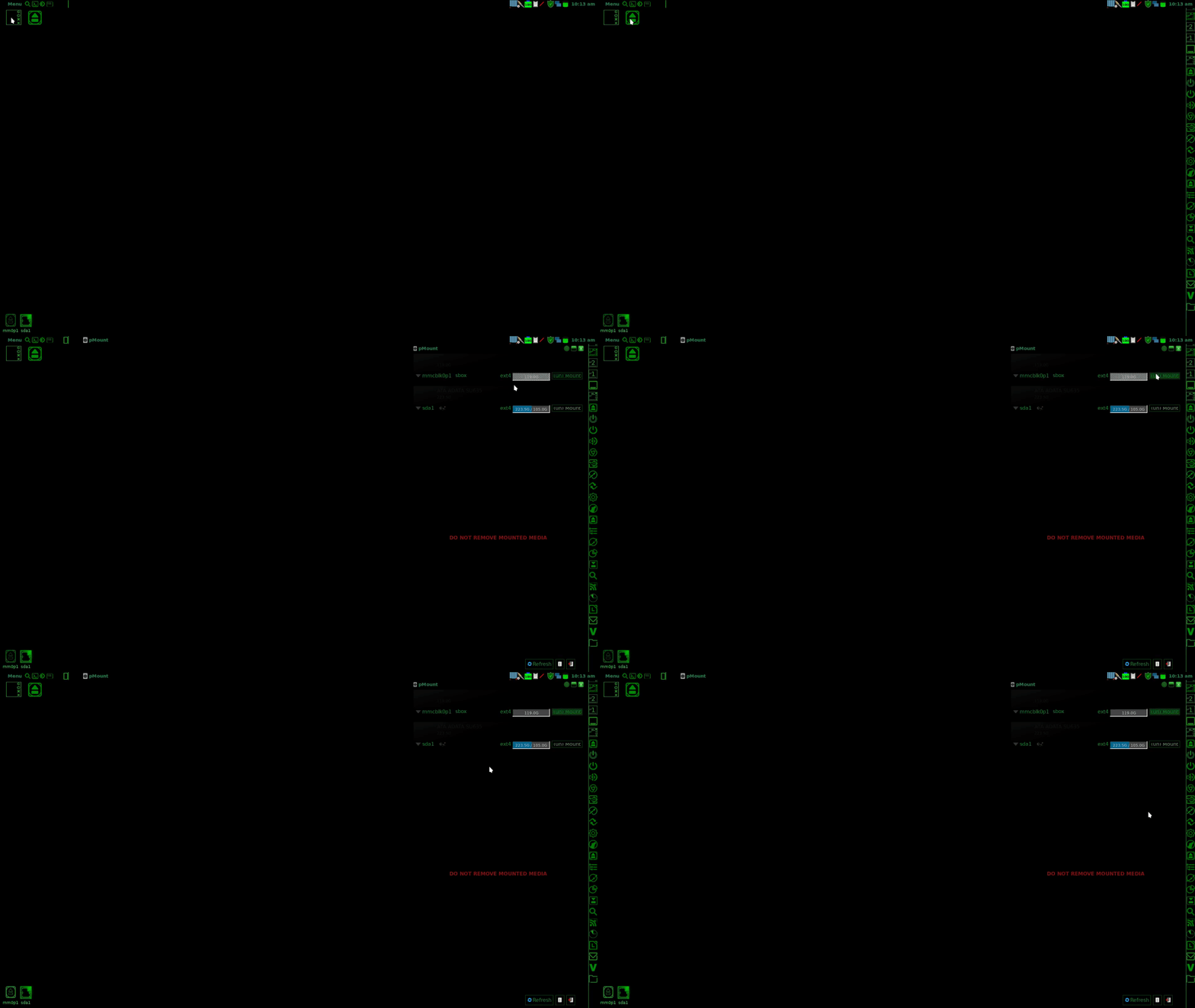
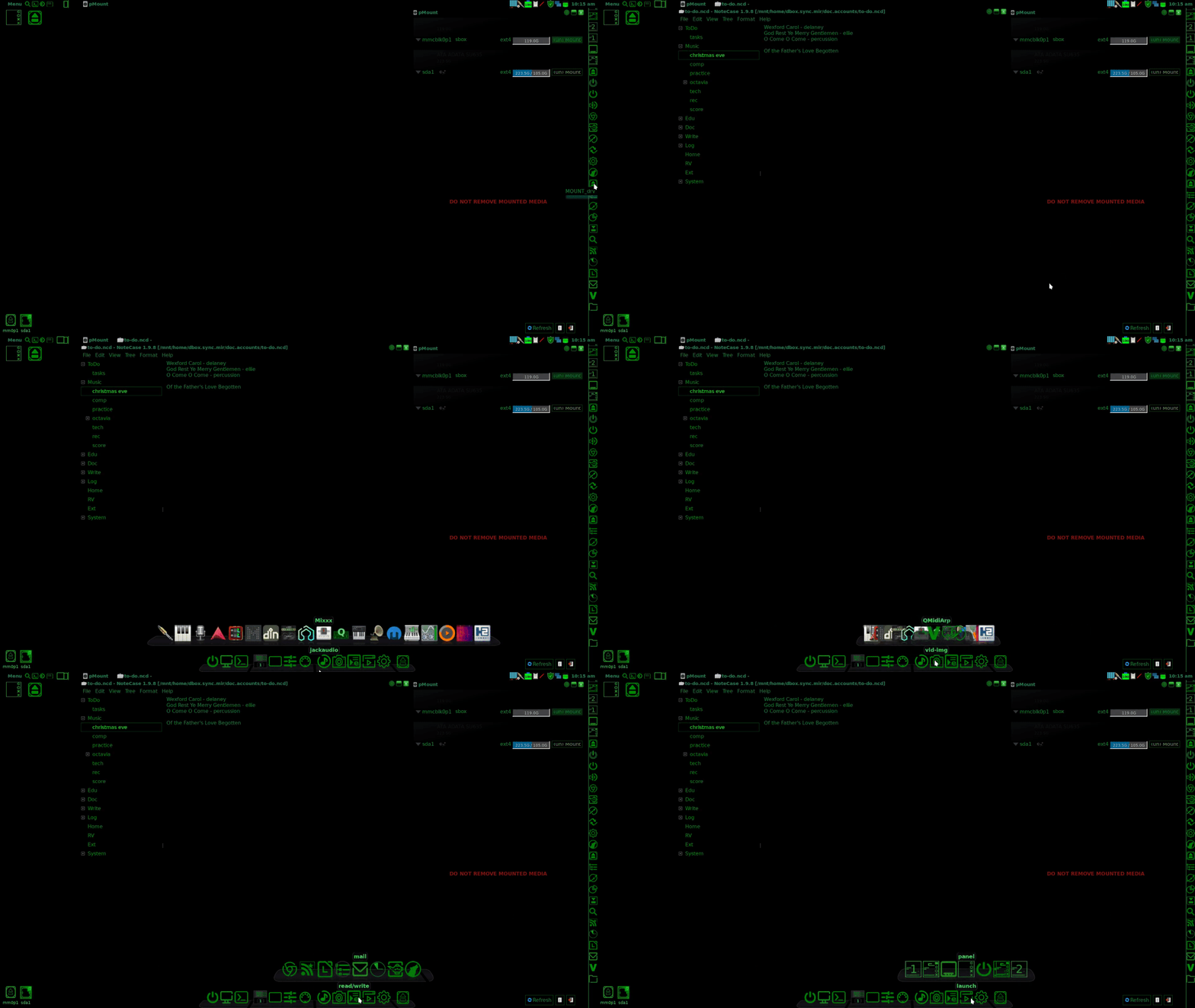
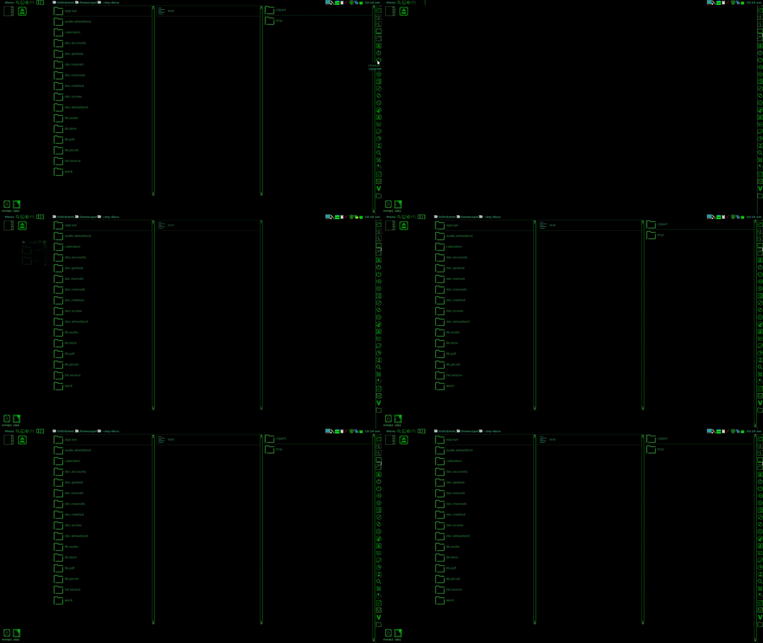
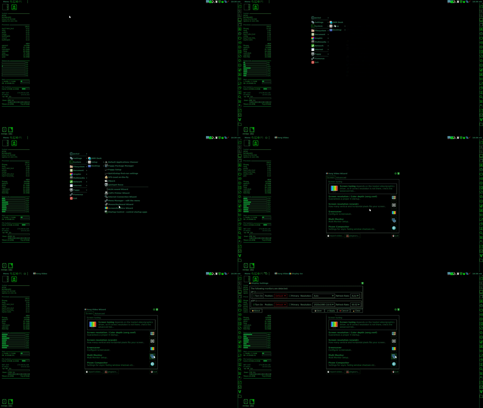
I'll be starting a new thread on the 'workflow aesthetic' soon. But I had a little time so I took some gif's.

Last night I found another gtk black theme to modify. It was a much simpler organization structure than the Trinity theme I modified. I re-did all the elements in gtk-2.0, edited gtkrc file, and combined it with the Trinity gtk-3 theme, and I have a new fully functional and sharp theme. It took about 4 hours. I think I have this down now, and it might be cool to do a Fossapup remaster at some point and call it 'Console-Pup.'

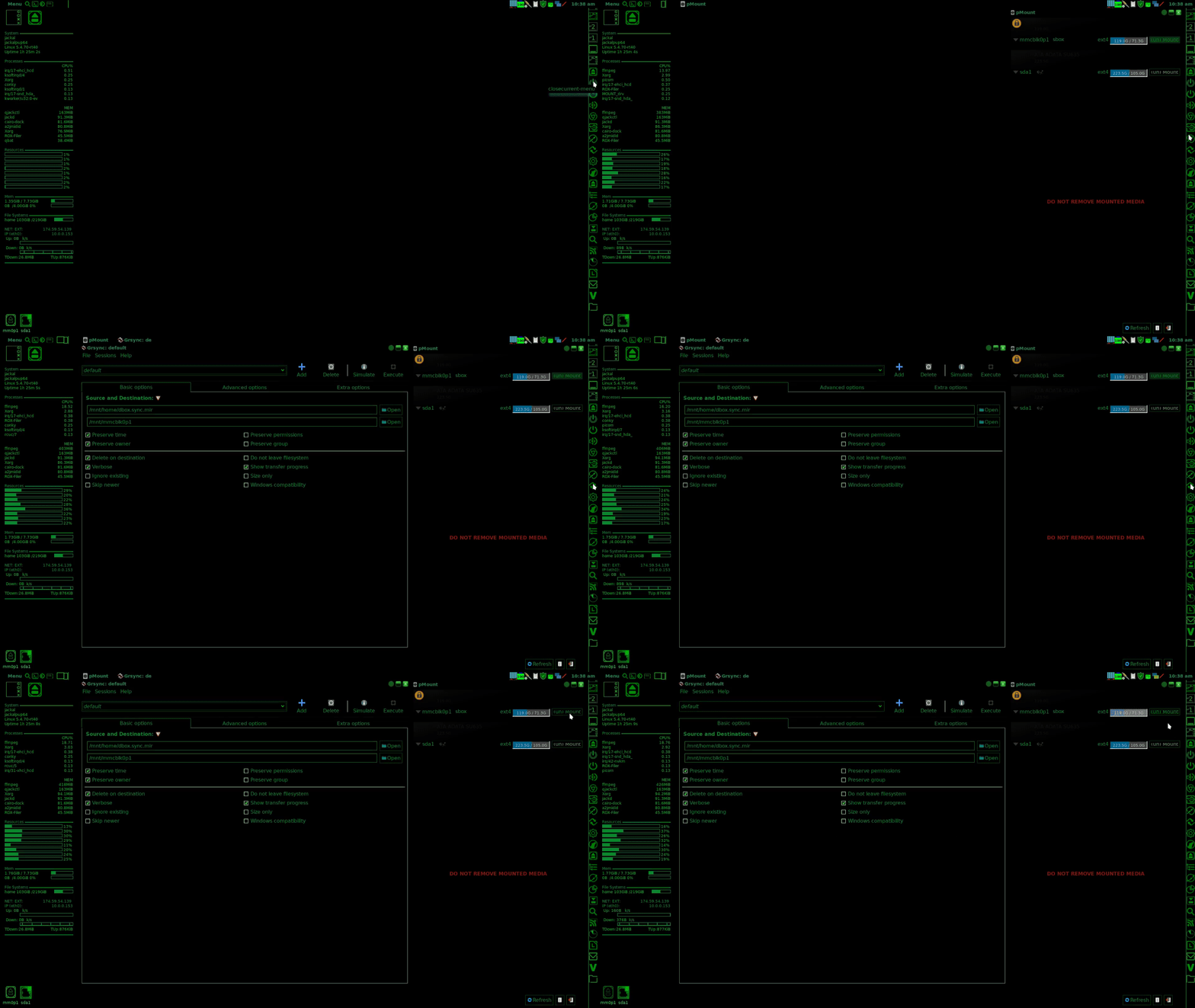
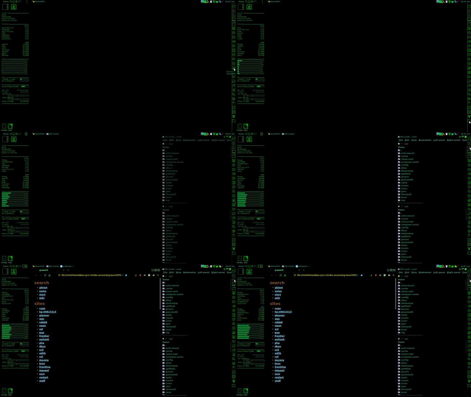
These gifs demonstrate how starting from a clean desktop, panels, docks, apps and file managers can be opened and their positions set with scripts launched from the panel. The gifs change the color of some of the apps a bit, but they get the point across.

Opening the panel, running the MOUNT_drv script, mounting an sd card.
Image

Opening notecase, popping up the Cairo dock.
Image

Shutting down and opening three ROX windows placed and sized with a wmctrl script.
Image

Opening screen graphics wizard and multi-monitor from a right click to the menu on the desktop.Image

Opening fully sized and arranged MOUNT_drv and grsync from the panel, unmounting sd card.
Image

Opening Xfe and LibreWolf from the panel, setting them with a wmctrl panel script.
Image

Shutting down Libre and Xfe, opening geany and showing the gtk-3 Black theme menus.
Image

geo_c
Old School Hipster, and Such

User avatar
JASpup
Posts: 1653
Joined: Sun Oct 04, 2020 10:52 am
Location: U.S.A.
Has thanked: 70 times
Been thanked: 89 times

Re: 12 character hexidecimal color format used by Roxfiler?

Post by JASpup »

Very refined effort.

I especially like your Cairo implementation and tiled ROX windows.

I am weening off Pmount so all that is just Thunar or PCManFM on my machine.

I happen to be in my standard 32 Xenial w/just XFE, putting me on the desktop drive/event manager routine.

It's not that bad, but with a mounting file manager you don't need to see drives or Pmount.

I'm calling your setup: Matrix Puppy.

Attachments
matrix-h.jpg
matrix-h.jpg (87.89 KiB) Viewed 1083 times

On the Whiz-Neophyte Bridge
Linux Über Alles
Disclaimer: You may not be reading my words as posted.

geo_c
Posts: 2877
Joined: Fri Jul 31, 2020 3:37 am
Has thanked: 2197 times
Been thanked: 871 times

Re: 12 character hexidecimal color format used by Roxfiler?

Post by geo_c »

JASpup wrote: Sat Dec 18, 2021 3:01 am

Very refined effort.

I especially like your Cairo implementation and tiled ROX windows.

I am weening off Pmount so all that is just Thunar or PCManFM on my machine.

I happen to be in my standard 32 Xenial w/just XFE, putting me on the desktop drive/event manager routine.

It's not that bad, but with a mounting file manager you don't need to see drives or Pmount.

I'm calling your setup: Matrix Puppy.

I have anywhere from 3 to 6 ROX windows open at any given time. ROX is versatile like that. You can do things with it that I don't think work with any other file manager. Like have 17 windows open at a time, and it doesn't even blink, or make the window the size of one icon, run without a menu whatsoever, just crazy stuiff. I often open two Xfe windows at a time and occasionally I run into some bugs. Still I like Xfe for opening documents and such. ROX is great for managing icons and jpegs, as it displays those nicely without a viewer window. Lots of options in ROX, and I'm starting to become one of the Puppy User ROX true believers. Window control scripts are big help though because it gives stable window positioning.

I actually like using pmount with the driver script that doesn't automatically open a file manager. It gives me the ability to quickly mount and access the drive from various applications. Having the mounter script launched from the desktop makes that truly convenient.

MATRIX PUP has a nice ring. I really think once this theme is really fine tuned, I mean down to the last detail. I might do a clean remaster. Interesting though, I get slightly different results from this theme in Fossapup than I do in Jackalpup. Things like the insensitive text color being white in Fossa, rather than the color I have chosen.

geo_c
Old School Hipster, and Such

User avatar
JASpup
Posts: 1653
Joined: Sun Oct 04, 2020 10:52 am
Location: U.S.A.
Has thanked: 70 times
Been thanked: 89 times

Re: desktop colors and customization

Post by JASpup »

When I have more than two ROX windows open, my desktop tends to look sloppy. Would I do tiles if ROX were the only file manager? Youbetcha. This is the intrinsic advantage of tabbed browsing.

Having a bunch of windows open is a mix. Can Puppy handle it on a fast 64 machine? Sure, and it is also better than real-life clutter, but I like to think of it as the best way to accomplish something rather than a general way to operate, for focus and efficiency.

The accomplishment of your ROX panel in my eyes is incorporating it into your unified theme. I haven't seen one in months. I remember an efficient but quick-and-dirty look. Hiding + small uniform icons + black like the rest of the desktop is more pro-looking. One not seeing how they normally look would be none-the-wiser.

If you're using wmctrl, how many icons are you comfortable looking for in a single window? I could see that for one type of icon, but not a comprehensive set. It would be more useful if it hides as well.

My XFCE desktop at moment only contains Trash. JWM yesterday it was Trash & Xlock. I would consider wmctrl to use Trash & Xlock in the same icon space, if I am understanding how it works. Then instead of your ROX panel I would keep using a 2nd JWM tray + Tray-1 launchers for everything else.

In XFCE panel (tray) launchers stack to only take up one space:

xfce-panel-launcher.png
xfce-panel-launcher.png (3.76 KiB) Viewed 1147 times

XFE is a little buggy but not enough to detract from use. A fav feature is how clicking on a script brings up the dialog that lets you run it in terminal or normally.

I'm setting up single line scripts to run in terminal normally, but otherwise it is a manual choice for all the running feedback and echo commands reminding me what the script is doing.

Peebea is having Pmount run on external media plug-in (new 64 isn't in my head at the moment). I think it should be an option.

32 I really am torn between Tahr & Xenial because Tahr is significantly smaller, but Xenial has all the functionality I expect. The innovation of 32 Bionic is Places in the tray keeping partition access handy if you clear the pinboard while keeping all partition settings the same.

32bionic-findnrun-places.png
32bionic-findnrun-places.png (13.22 KiB) Viewed 1143 times

32 Bionic with FindNRun and Places as a drive icon with a better highlight color. I don't use Bionic but am interested in Places.

JWM is probably better than XFCE for creating a highly-customized cockpit desktop, but the nod will go to XFCE for out-of-the-box aesthetics and ease. JWM is for the average programmer. XFCE is for the average Windows convert. One using Ubuntu or Mint could go either way.

I get slightly different results from this theme in Fossapup than I do in Jackalpup. Things like the insensitive text color being white in Fossa, rather than the color I have chosen.

Jackal would enhance it as a DAW workstation.

From a social standpoint it's a refined offering for a limited audience. Even something as seemingly mundane as using XFCE in Puppy instead of JWM limits the help you have access to on it, because even though it's XFCE, it's still Puppy underneath the hood. Only a user with the same two layers is going to know what your challenge is.

Despite outstanding looks, the more technical and custom a puplet is, the more it is for users really looking for it.

On the Whiz-Neophyte Bridge
Linux Über Alles
Disclaimer: You may not be reading my words as posted.

User avatar
JASpup
Posts: 1653
Joined: Sun Oct 04, 2020 10:52 am
Location: U.S.A.
Has thanked: 70 times
Been thanked: 89 times

Re: ROX panel customization (color and hiding)

Post by JASpup »

@geo_c I missed where the ROX panel background is changed. Can we do it in the XML config?

/root/.config/rox.sourceforge.net/ROX-Filer/pan_Right:

Code: Select all

<?xml version="1.0"?>
<panel side="Right">
  <options style="1" width="52" avoid="0" xinerama="1" monitor="0"/>
  <start>
    <icon label="Home">~</icon>
    <icon label="Apps">/usr/local/apps</icon>
  </start>
  <end/>
</panel>

The JWM tray is the inactive background color. I also see ROX panel auto-hiding inconsistently, while not an apparent setting. The default is #DCDAD5.

On the Whiz-Neophyte Bridge
Linux Über Alles
Disclaimer: You may not be reading my words as posted.

geo_c
Posts: 2877
Joined: Fri Jul 31, 2020 3:37 am
Has thanked: 2197 times
Been thanked: 871 times

Re: ROX panel customization (color and hiding)

Post by geo_c »

JASpup wrote: Sun Dec 19, 2021 8:19 pm

@geo_c I missed where the ROX panel background is changed. Can we do it in the XML config?

/root/.config/rox.sourceforge.net/ROX-Filer/pan_Right:

Code: Select all

<?xml version="1.0"?>
<panel side="Right">
  <options style="1" width="52" avoid="0" xinerama="1" monitor="0"/>
  <start>
    <icon label="Home">~</icon>
    <icon label="Apps">/usr/local/apps</icon>
  </start>
  <end/>
</panel>

The JWM tray is the inactive background color. I also see ROX panel auto-hiding inconsistently, while not an apparent setting. The default is #DCDAD5.

My ROX panel has the GTK-2.0 background color. It is essentially like a ROX window in terms of theming as far as I can tell. I don't know much about whether the colors can be customized. I'm not familiar with panel's particular integration.

If you're using a frugal install, the solution for me is to make a backup of the pupsave, and experiment away. For instance I just loaded my Cairo-dock.sfs in a Fossapup save and it broke my GTK-theme. Not sure why that happens, but it does. So I went back to the original pupsave backup I made before hand.

geo_c
Old School Hipster, and Such

User avatar
JASpup
Posts: 1653
Joined: Sun Oct 04, 2020 10:52 am
Location: U.S.A.
Has thanked: 70 times
Been thanked: 89 times

Re: ROX panel customization (color and hiding)

Post by JASpup »

geo_c wrote: Sun Dec 19, 2021 8:28 pm

My ROX panel has the GTK-2.0 background color. It is essentially like a ROX window in terms of theming as far as I can tell. I don't know much about whether the colors can be customized. I'm not familiar with panel's particular integration.

If you're using a frugal install, the solution for me is to make a backup of the pupsave, and experiment away. For instance I just loaded my Cairo-dock.sfs in a Fossapup save and it broke my GTK-theme. Not sure why that happens, but it does. So I went back to the original pupsave backup I made before hand.

My ROX panels are always the same color independent of GTK. I haven't experimented, but I just stumbled upon this in the old forum (gtkrc.mine again):

=-=-=-=-=

You can also texture or color your ROX-panels by adding and configuring a gtkrc.mine file in /root. Here is an example from what I use.

=-=-=-=-=
pixmap_path "/usr/share/backgrounds"
# Note the path above: that's where you'd put your textures or pictures for the ROX-filer and the ROX-panel.
# gtkrc.mine (example)
style "rox" = "default"
{
bg_pixmap[NORMAL] = "lignes-gris2.png"
# Un-comment this if you want to use a texture or small picture as a background in the ROX-Filer window.
# "flute_smooth1a4.png"
}
widget_class "*Collection*" style "rox"

style "panel-style" {
bg_pixmap[NORMAL] = "Lejeunehommeetlamer-16x-2.png"
# This would be for a small square picture (16x16) or for a strip of your current desktop at the top of your screen (say, a strip of 1024x16 pixels)
# "calm-waters-Rickydavid-haut.png"
# The choice of another picture can be commented and stay in the file for easy modification if you change the background picture.
# bg[NORMAL] = "#AABFD7"
# Un-comment the above line if you want your ROX-panel to be of a single color, but then be sure that you comment with a # the "bg_pixmap" line above. You can't have both at the same time!
# It can be the name or the number of a color.
# "DarkGoldenrod4" # for example
font_name = "Liberation Sans 14"
# The name says it all! You can define a font here as well, from the fonts you have in /usr/share/fonts/Default/TTF.
# "Georgia 11" # Again, an alternative can be at the ready within the file.
}
widget "rox-panel.*" style "panel-style"
### end ###
=-=-=-=-=
Ending notes:
Don't touch the structure ( the labels and the {} ) of the gtkrc.mine file, or you'll be in trouble.

Some gtk themes might have a color or a texture for the ROX-panel already. The "ichigo" theme comes to mind. But most do not.

If you want to see the effect, I have put illustrations of ROX-panels at the top in the wmx and echinus forums.

=-=-=-=-=
Sources :
http://roscidus.com/desktop/node/181 (background of filer)
http://roscidus.com/desktop/node/182 (ROX-panel)

BFN.

https://oldforum.puppylinux.com/viewtop ... 36#p364036

I assumed you knew how to make a panel transparent or the same color as your backdrop. Color is just as important as hidability. On the pinboard, you don't need a panel if you can't hide it or stack launchers.

This isn't a lot of options:

rox-panel-options.png
rox-panel-options.png (42.73 KiB) Viewed 1114 times

Resorting to old pupsaves after explosions are a great frugal Puppy feature. I need them mostly for updating live boots.

On the Whiz-Neophyte Bridge
Linux Über Alles
Disclaimer: You may not be reading my words as posted.

User avatar
JASpup
Posts: 1653
Joined: Sun Oct 04, 2020 10:52 am
Location: U.S.A.
Has thanked: 70 times
Been thanked: 89 times

Re: Unique ROX Panels - color & options

Post by JASpup »

@geo_c this just crossed my path:

slacko6-panel.png
slacko6-panel.png (16.28 KiB) Viewed 1091 times

It looks just like a ROX panel except:

  • It has no apparent customization settings (unlike gui in last post)

  • Its color is the JWM background (notice same as tray)

  • It autohides by default

It was created by choosing a Slacko6 Ptheme setting.

Digging I've discovered it is a JWM 2nd tray.

I would guess that is what your panel is, not a ROX panel.

On the Whiz-Neophyte Bridge
Linux Über Alles
Disclaimer: You may not be reading my words as posted.

geo_c
Posts: 2877
Joined: Fri Jul 31, 2020 3:37 am
Has thanked: 2197 times
Been thanked: 871 times

Re: Unique ROX Panels - color & options

Post by geo_c »

JASpup wrote: Tue Dec 21, 2021 5:30 am

@geo_c this just crossed my path:
It looks just like a ROX panel except:

  • It has no apparent customization settings (unlike gui in last post)

  • Its color is the JWM background (notice same as tray)

  • It autohides by default

It was created by choosing a Slacko6 Ptheme setting.

Digging I've discovered it is a JWM 2nd tray.

I would guess that is what your panel is, not a ROX panel.

Well that's cool. But mine is created by this script I was given by @williams2. It looks like this:

Code: Select all

#!/bin/sh
f=/tmp/flag
if test -f $f
then
  rox -r=
  rm -f $f
else
  rox -r charm
  touch $f
fi

it is a ROX panel. But my ROX window has a black background just like my JWM tray, so I'd have to try it on a different theme to see what happens.

EDIT No scratch that. It assumes the background of the theme. I say that because when I load a cairo-dock.sfs I created into Fossapup, eventually it blows my GTK-theme right out of there, and the background color of the panel becomes white like the rest of the windows. It seems to revert to a built in theme.

geo_c
Old School Hipster, and Such

User avatar
JASpup
Posts: 1653
Joined: Sun Oct 04, 2020 10:52 am
Location: U.S.A.
Has thanked: 70 times
Been thanked: 89 times

Re: Customizing auxiliary trays / panels in JWM

Post by JASpup »

geo_c wrote: Wed Dec 22, 2021 4:22 am

it is a ROX panel. But my ROX window has a black background just like my JWM tray, so I'd have to try it on a different theme to see what happens.

EDIT No scratch that. It assumes the background of the theme. I say that because when I load a cairo-dock.sfs I created into Fossapup, eventually it blows my GTK-theme right out of there, and the background color of the panel becomes white like the rest of the windows. It seems to revert to a built in theme.

Well, I'm flabbergasted. If I create a Rox panel with a right-click pinboard icon menu, how is that any different from the script?

Now we have:

  1. Rox panels

  2. JWM 2nd trays

  3. JWM 2nd trays that look like Rox panels

  4. Rox panels that look like JWM 2nd trays that look like Rox panels, created by master users

For #'s 2&3 the background can be controlled by the JWM theme, but not independent of other object attributes. #4 is controlled by GTK? Maybe there is an easy way to control their appearance and function. I don't believe it is a normal function to edit a #1 background. It would be important to know their differences. E.g., I do not know how to shrink #3 to look like a regular JWM 2nd tray (#2). They normally expand given the number of entries present.

What other features do we have over the pinboard? Why use one over the other?

Icon size. They all auto-hide?

I'm struggling with a JWM 2nd tray in 32 Xenial. Some icons will not show, and when not present, the command is missing in the tray. I started with a 2-item tray. Now I'm editing a 12 and it's starting to work, precariously.

Otherwise I'm still struggling with partition mounting and a browser system.

On the Whiz-Neophyte Bridge
Linux Über Alles
Disclaimer: You may not be reading my words as posted.

Post Reply

Return to “Users”