SwitchT - Proof of Concept, ready for a spin.

Moderator: Forum moderators

Post Reply
geo_c
Posts: 2879
Joined: Fri Jul 31, 2020 3:37 am
Has thanked: 2202 times
Been thanked: 876 times

SwitchT - Proof of Concept, ready for a spin.

Post by geo_c »

The theme pack can be downloaded here: https://mega.nz/file/ibowEZZT#BbHcrZqjx ... Fa_gCheYZ0

I'm looking for someone with time and energy to run it on a clean ram boot, or a backup pupsave, as I haven't written an un-install script yet.

Below is a quick tutorial: clicking on the pictures will enlarge them on the host site, click the back button in your browser to come back to the thread.

Boot up Fossapup64.9.5 in RAM
Image

Boot up JWMDesk Manager from the menu, so that it's logout.desktop file will be created for use by a rox panel
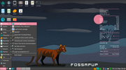
Image

And then simply click 'quit'
Image

Since you're in RAM, mount the drive where the SwitchT-MASTER folder is unzipped.
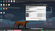
Image

Mine is on sdb2
Image

Inside the folder run the 'INSTALL-SwitchT' script by clicking it, wait for a few to several seconds depending on the speed of your media and device
Image

When you see this message, choose 'Yes, open Theme Chooser'
Image

This is the Theme Chooser, choose 'OOMOX-Theme'
Image

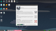
It will warn you that choosing a theme will restart Xwin.
Image

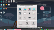
After X-server restarts, the desktop should look like this. The tray is at the top on auto-hide, and a ROX panel has been added to the right side, which can be turned off with a right click, but leave it up for now. It'll make switching themes quicker. And you might like it.
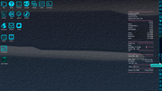
Image

This picture shows the JWM tray at the top in addition to a second panel at the bottom, which has more applications. Both panels contain a greenish looking switch/refresh icon which is the SwitchT Chooser script. The two square icons between the SwitchT-chooser and Palemoon are the panel toggles. They are self-explanatory, and there is one of them for each panel in both panels. So you can toggle either panel on or off from the other panel. Sometimes it may take two clicks depending on how the panel was previously shut down. The panel toggles are also located in the JWM tray next to the terminal icon.
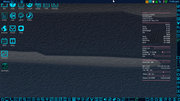
Image

Let's turn on JWMdesk from the right panel:
Image

and shut off conky, because it doesn't match the theme! And it's kind of annoying at times. Though I do have matching conky's which may be included later.
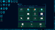
Image

Let's switch the theme again
Image

Choosing NEO-CONSOLE this time
Image

just in case you have some important files to save, you'll see this warning and can back out, or just don't click anything, save your files, and then choose 'yes'
Image

This is switched to NEO-CONSOLE with the bottom panel on, I'm opening the right panel with the panel-SwT icon.
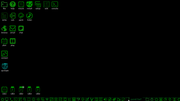
Image

But let's run the SwitchT-chooser again from the panel and see what our original theme looks like, which was backed up at install.
Image

Well, it doesn't have the original desktop background, because I decided that switching backgrounds automatically is most likely annoying for many people. And the panel doesn't have the UniChrome icons, because Rox has reverted to the Original theme, by design. Also the 'listen' icon has remained, as I made a desktop file for it because it's not a 'default icon' so to speak. So, uh, that's a bug, let's be honest.
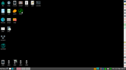
Image

ROX is back to it's out-of-the-box status!
Image

And since the panel is now tough to read, I'll launch the script 'SwitchTDRK-CHOOSER' from /root/SwitchT-DRK in the file manager
Image

getting the familiar dialog
Image

Back to OOMOX
Image

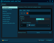
The right panel has a launcher for lxappearance, the GTK theme chooser
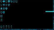
Image

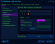
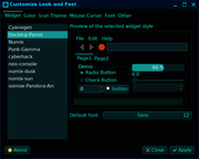
Let's look at the other GTK themes installed with this package. Everything but numix themes are added by INSTALL-SwitchT
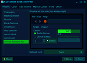
Image
my very green console, which looks its best on systems that have brightness controls, like 'dcontrol'
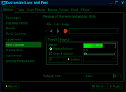
Image
cyberhack, blends well with both UniChrome icon themes
Image
Punk Gamma, more cheery and energetic
Image
Hacking Parrot, I like the scheme, and it's the only one that isn't flat, it uses gradients.
Image
Cyanogen, very subdued blue.
Image

The Chooser is in the panel, and the icon stands out.
Image

But first let's find a matching JWM theme for the current GTK theme
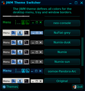
Image

Now let's save that combination of JWM and GTK to a custom theme
Image
It saved, now let's choose it so we can restart X and make sure ROX is totally on board, etc
Image
Image

And here's the new theme and the chooser ready to go again!
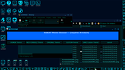
Image

Back to the original, it's too dark in here.
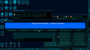
Image

Ah now let's get that Fossa background and all will be right again.
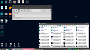
Image

geo_c
Old School Hipster, and Such

TerryH
Posts: 637
Joined: Mon Jun 15, 2020 2:08 am
Has thanked: 158 times
Been thanked: 160 times

Re: SwitchT - Proof of Concept, ready for a spin.

Post by TerryH »

I know this was intended for Fossapup64, but I installed on an existing bionicpup64 install. I've never used or seen rox panels previously, so this was a learning experience. The restore Original theme function is nice, very easy to roll back.

The only query I have is that 'goggles music manager' in particular and also 'geany' are displayed with text under them, which makes the panel wide to fit all the text under the icon. The 2 icons are also huge and when you mouse over them, they don't have a popup. I right clicked and selected Edit Item to remove the text, which made the icons appear the same size as the other icons. I have attached a screenshot of the panel. I noticed that the googlesmm.desktop appears to be a manually created. I don't know if this has anything to do with this issue. No idea why geany also appears effected.

I'll continue to have a play around with SwitchT.

Edit: I right clicked the panel and then selected Panel options. Changing the display, which was set as 'Image only for applications' to 'Image only' altered the display as expected.

Attachments
The text may be slightly diffeent, screenshot taken after editing.
roxpanel.png (55.38 KiB) Viewed 1515 times

New Laptop - ASUS ZenBook Ryzen 7 5800H Vega 7 iGPU / 16 GB RAM

geo_c
Posts: 2879
Joined: Fri Jul 31, 2020 3:37 am
Has thanked: 2202 times
Been thanked: 876 times

Re: SwitchT - Proof of Concept, ready for a spin.

Post by geo_c »

TerryH wrote: Sun Feb 13, 2022 2:19 am

I know this was intended for Fossapup64, but I installed on an existing bionicpup64 install. I've never used or seen rox panels previously, so this was a learning experience. The restore Original theme function is nice, very easy to roll back.

The only query I have is that 'goggles music manager' in particular and also 'geany' are displayed with text under them, which makes the panel wide to fit all the text under the icon. The 2 icons are also huge and when you mouse over them, they don't have a popup. I right clicked and selected Edit Item to remove the text, which made the icons appear the same size as the other icons. I have attached a screenshot of the panel. I noticed that the googlesmm.desktop appears to be a manually created. I don't know if this has anything to do with this issue. No idea why geany also appears effected.

I'll continue to have a play around with SwitchT.

Edit: I right clicked the panel and then selected Panel options. Changing the display, which was set as 'Image only for applications' to 'Image only' altered the display as expected.

Thanks for taking it for a spin. I didn't get that behavior on Fossapup, but that is typical of a ROX panel, being that when an icon or shortcut link is broken, the panel displays the text and grows to adjust to the text. So does Bionic have Goggles installed, or is it perhaps in a different location, or the application.desktop file is a different name? Goggles panel icon is linked to usr/share/applications/gogglesmm.desktop, but Geany I noticed is linked to usr/bin/geany, and that's a mistake on my part.

EDIT - to fix the Geany link see below.

Last edited by geo_c on Sun Feb 13, 2022 7:42 pm, edited 1 time in total.

geo_c
Old School Hipster, and Such

geo_c
Posts: 2879
Joined: Fri Jul 31, 2020 3:37 am
Has thanked: 2202 times
Been thanked: 876 times

Re: SwitchT - Proof of Concept, ready for a spin.

Post by geo_c »

@TerryH

Actually you can fix that geany link by unzipping and dropping this attached panel config file in /root/.config/rox.sourceforge.net/ROX-Filer/

pan_panel-SwT.tar
(10 KiB) Downloaded 69 times

geo_c
Old School Hipster, and Such

User avatar
JASpup
Posts: 1653
Joined: Sun Oct 04, 2020 10:52 am
Location: U.S.A.
Has thanked: 70 times
Been thanked: 89 times

Re: SwitchT - User Theme Review

Post by JASpup »

Image
oomox-Pandora-Arc - is sort of a hybrid, cyan like the others w/a daring brilliant lime active/highlight color. Lime is really the differentiation.

Image
Neo Console - the only true monochrome set, you get a green that looks across between glow-in-the-dark and military camouflage. Matching icon set is available for theme. In JWM looks good with Unix window buttons if you have a color title bar for contrast (tested as a theme only).

Image
Cyberhack - matches cyan themes w/a vivid fuscia cursor, but the grass green accents are not a flattering contrast. If one had to go, this would be my choice.

Image
Punk Gamma - wins The Fluorescent Award, most like a disco. It is more compelling at night with an other-worldly state of mind. Could use its own icons, as it does not match the Neo Console or cyan icon sets.

Image
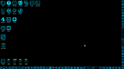
Hacking Parrot - this is the cyan theme with a PITCH BLACK background, another quality config for the greyphobes who need their black, black.

Image
Cyanogen - with the best in the collection, but has a certain cold feel you might not like if you're already cold. Hot it can be refreshing.

On the Whiz-Neophyte Bridge
Linux Über Alles
Disclaimer: You may not be reading my words as posted.

Post Reply

Return to “Eye Candy”