Page 1 of 1
Redesign of desktop, leaner, uncluttered
Posted: Tue Nov 16, 2021 11:38 am
by BarryK
An experiment:
https://bkhome.org/news/202111/experime ... t-rox.html
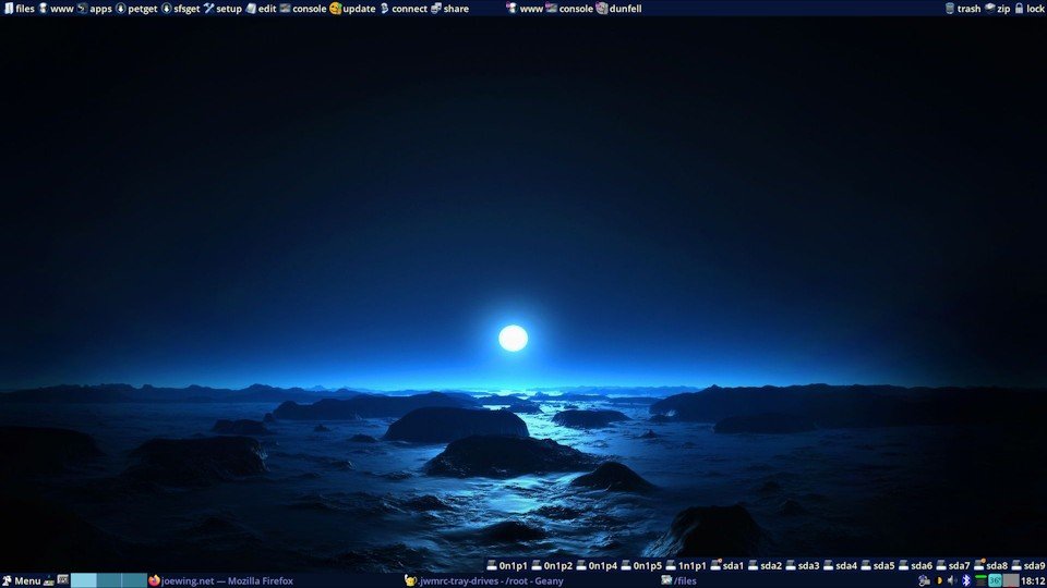
- desktop-policy-jwm.jpg (54.87 KiB) Viewed 855 times
A further thought: could put the drive icons into the bottom tray, and move the running apps into a separate tray.
The photo shows three running apps, firefox, geany and rox, but they could be in a separate tray. The adavantage of this is when no apps running, such as at first bootup, the running-apps tray will not exist. It will only grow as apps are launched.
That would result in a desktop with just two trays, top and bottom, for leanest and uncluttered first impression.
Re: Redesign of desktop, leaner, uncluttered
Posted: Tue Nov 16, 2021 1:10 pm
by amethyst
I would put it in trays that can be hidden and then "unhidden" it if you hover over it with your mouse or even design menu entries for all those stuff. Actually, I would put it in the menu, I'm not the biggest fan of trays although I use it.
Re: Redesign of desktop, leaner, uncluttered
Posted: Tue Nov 16, 2021 1:51 pm
by TerryH
A setup like this for me is ideal. I remove all icons from the desktop, using a second tray. When EasyOS came along with Containers, the constant container icons through me off. I edit the .xinitrc to remove the check, so I can remove the icons and not have them keep coming back. I am currently using a third manually created tray for the container launch icons.
Re: Redesign of desktop, leaner, uncluttered
Posted: Tue Nov 16, 2021 4:49 pm
by bigpup
A further thought: could put the drive icons into the bottom tray, and move the running apps into a separate tray.
If someone had the number of drives, as shown in your desktop image, the tray would be full of nothing but drives.
I assume the trash is still the Puppy trash.
How does having it in the top tray affect drag and drop to it?
I assume, the right click trash icon menu, still would show the same options, as it does for the desktop trash icon.
Any number of hidden trays is not bad, but having two trays always showing, not for me.
In fact, I always move the bottom tray to the top, and have no tray on the bottom.
Seems more natural to me, to go from top down, when clicking on the menu, and navigating in it.
Hidden trays on left and right, no tray ever on bottom.
The drive icons are along bottom of desktop and can be adjusted for specific location.
Example:
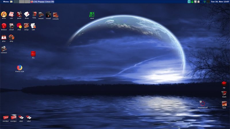
- Screenshot(1).jpg (53.52 KiB) Viewed 809 times
Re: Redesign of desktop, leaner, uncluttered
Posted: Wed Nov 17, 2021 1:57 am
by BarryK
bigpup wrote: ↑Tue Nov 16, 2021 4:49 pm
I assume the trash is still the Puppy trash.
How does having it in the top tray affect drag and drop to it?
I assume, the right click trash icon menu, still would show the same options, as it does for the desktop trash icon.
Didn't think of that!
Drag and drop to the trash doesn't work.
Don't know if JWM can be configured to recognise mouse right-click.
Re: Redesign of desktop, leaner, uncluttered
Posted: Wed Nov 17, 2021 2:15 am
by bigpup
The trash is a Rox application.
Re: Redesign of desktop, leaner, uncluttered
Posted: Wed Nov 17, 2021 2:38 am
by BarryK
Looked up the jwm online docs: entries in a tray can be made to respond to left, middle and right mouse button click.
https://joewing.net/projects/jwm/config.html
In the <Tray> tag, have got this entry for "lock", and inserted a <Button> tag just to test;
Code: Select all
		<TrayButton popup="Lock screen" icon="/usr/local/apps/Xlock/.DirIcon" label="lock">
			exec:/usr/local/apps/Xlock/AppRun
			<Button mask="3">exec:leafpad</Button>
		</TrayButton>
...yes, right-click launches leafpad.
Would need to create an app that provides the same right-click behaviour as does rox.
So in theory, doable. But don't think can have drag and drop. So would have to leave out "trash" and "zip".
Re: Redesign of desktop, leaner, uncluttered
Posted: Wed Nov 17, 2021 11:02 am
by BarryK
Just looked on the old forum, the idea of doing away with rox and just having jwm, was discussed way back in 2010:
https://oldforum.puppylinux.com/viewtopic.php?t=51200
idrivepanel looks interesting:
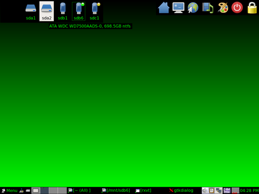
- Idrivepanel.png (27.11 KiB) Viewed 714 times
The old puppy forum has so much useful information! Years and years of creativity.
It is great that rockedge managed to save it, and keep it archived read-only.
(if you want to show your appreciation to rockedge, there is a donation button top of forum page).
Re: Redesign of desktop, leaner, uncluttered
Posted: Thu Nov 18, 2021 9:56 am
by scsijon
I wonder if you could set individual application groups up inside individual virtual desktops, something like the sugarlabs sugar system does.
I've been playing with sugar and working out how to assign application groups depending in what user group you are designation at a 'virtual login' rather as it is with an age group. I haven't tried with jwm yet, but may switch once you have a stable system that I can build within.
as a fyi sugar is the sugarlabs school learning system, see https://www.sugarlabs.org/ for more details.
Re: Redesign of desktop, leaner, uncluttered
Posted: Sat Nov 20, 2021 2:04 am
by Misaligned
Personally, I prefer not to have my desktop cluttered with icons. I like to see the drive icons though for quick access and for reference which drive is mounted or not. I like to see a wallpaper, but it should be something simple, something that does not distract too much, but is nice to look at. In regards to trays, to me it mainly serves the purpose of having a status info of my network connection, speaker volume, which desktop I am on and being able to see the time and cpu temp is nice too. Almost forgot, to see which apps are running.
But all the above is something that is fairly easy adjustable. I'd rather see the menu being more streamlined (definately like the right-click menu). Especially since there is a PupControl, maybe removing all the different apps that control the settings in the menu and just have them in the PupControl. I also would like to see a different icon set. Some of the icons are pixelated, blurry or hard to recognize. Maybe a different way of organizing icon themes, so if someone switches the icon theme, it would affect the change more on a global scale, not just desktop and main categories on the menu.
Not a friend of too many trays. Though I like wbar, it even has a taskbar option, which, I have to admit does not seem to work. At least I have problems with it.