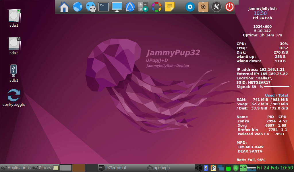
For those of you who aren't aware, these are the 'concept' desktop backgrounds for the already-under-development Windows 12, from a designer called "AddyVisuals".
https://www.windowslatestnews.com/windo ... allpapers/
Normally I like dark background stuff.....but the 'dark' variant of this doesn't look right, somehow. To me, it just looks drab.
Despite that, the 'light' variant just 'spoke' to me......with beguiling, come-hither tones. I like this type of focused, show-cased "abstract" stuff. Always have. So I 'Puppyfied' it. Yeah! ![]()
![]()
Mike. ![]()
(EDIT:- May need to modify it a wee bit by just dialling-down the saturation a smidgeon. That purple's a little bit "in yer face" for my liking. Subtle IS, after all, my middle name..! ![]() )
)


