Icons & the Desktop.....creating a workflow aesthetic?

Moderator: Forum moderators

geo_c
Posts: 2877
Joined: Fri Jul 31, 2020 3:37 am
Has thanked: 2197 times
Been thanked: 872 times

Icons & the Desktop.....creating a workflow aesthetic?

Post by geo_c »

[This topic has been split off from "Show Us Your Desktop", since it was almost becoming its own secondary "topic within a topic"... Hence why the reply titles don't match!]

__________________________________________________

Imagearvest near me

Just sharing my latest system. I was playing around with Q-Dir, a quad pane filemanager, on my Windows computer at work, and I got hooked. I use XFE alot, so because it saves window position and size, I realized I could simply open it twice sized at half the screen, and that allows me to drag and drop between four panes.

I also tweaked puddlemoon's Cayan them with the JWM theme maker .pet

The screenshot looks dingy, but it's real easy on the eyes in real life.

Last edited by mikewalsh on Thu Aug 26, 2021 11:05 am, edited 1 time in total.
Reason: Additional text...

geo_c
Old School Hipster, and Such

backi
Posts: 600
Joined: Thu Jul 23, 2020 2:28 pm
Has thanked: 76 times
Been thanked: 70 times

Re: Show Us Your Desktop

Post by backi »

@geo_c wrote:

I use XFE alot,

So i do........but could not figure out.... until now...... how to mount Drive/Partitions with XFE.........

Anyone any Idea on this ?

User avatar
JASpup
Posts: 1653
Joined: Sun Oct 04, 2020 10:52 am
Location: U.S.A.
Has thanked: 70 times
Been thanked: 89 times

Re: Show Us Your Desktop

Post by JASpup »

backi wrote: Fri Aug 06, 2021 3:50 pm

So i do........but could not figure out.... until now...... how to mount Drive/Partitions with XFE.........

Anyone any Idea on this ?

Bird flock, I just made a post on this subject: viewtopic.php?f=4&t=3670

Never figured out how to mount a partition that hasn't already been mounted.

On the Whiz-Neophyte Bridge
Linux Über Alles
Disclaimer: You may not be reading my words as posted.

User avatar
greengeek
Posts: 1383
Joined: Thu Jul 16, 2020 11:06 pm
Has thanked: 534 times
Been thanked: 192 times

Re: Show Us Your Desktop

Post by greengeek »

Basic Tahr32

tahr32.png
tahr32.png (61.97 KiB) Viewed 3852 times
Last edited by greengeek on Fri Aug 27, 2021 7:20 am, edited 2 times in total.
backi
Posts: 600
Joined: Thu Jul 23, 2020 2:28 pm
Has thanked: 76 times
Been thanked: 70 times

Re: Show Us Your Desktop

Post by backi »

Thanks anyway......
Found a comfortable Hack .....(since i am on the"Dogs")....i installed "desktop-drive-icons"........via Synaptic.
Left Mouse click on one of those Desktop---- Drive/Partition Icons .......In settings...... i just replaced "Post mount command" and "Post unmount command" with xfe.
Works quite comfortable.

Regards!

geo_c
Posts: 2877
Joined: Fri Jul 31, 2020 3:37 am
Has thanked: 2197 times
Been thanked: 872 times

Re: Show Us Your Desktop

Post by geo_c »

backi wrote: Sat Aug 07, 2021 1:35 pm

Thanks anyway......
Found a comfortable Hack .....(since i am on the"Dogs")....i installed "desktop-drive-icons"........via Synaptic.
Left Mouse click on one of those Desktop---- Drive/Partition Icons .......In settings...... i just replaced "Post mount command" and "Post unmount command" with xfe.
Works quite comfortable.

I already have drive icons, and use that, also, the hardrive Icon I have on my desktop at the upper left labeled 'mount' is actually a link to pmount. But where is this Post mount command located? Because using the drive icon at the moment opens a Rox window, so it requires two clicks to mount and close the Rox window to see my drives in XFE.

XFE is great for file management, but the one drawback is it doesn't display large thumbnails. So it's not great when managing graphic files like jpegs. I still like ROX, and could do just fine without XFE, but I do like the clean slick look and window consistency of XFE. Once I realized drag and drop works between unique XFE windows (though not between ROX and XFE windows) it opened up the possibility of having an 8 pane filemanager, four panes on each display. And to those who would think, "who needs that?' I'll say it comes in handy when managing files on multiples drives with multiple partitions. I have a bootable 3TB USB hard drive with 4 different partitions, and sd cards and native hard drives. So panes take away the pain of keeping it all straight in my brain.

Last edited by geo_c on Sat Aug 07, 2021 9:33 pm, edited 5 times in total.

geo_c
Old School Hipster, and Such

backi
Posts: 600
Joined: Thu Jul 23, 2020 2:28 pm
Has thanked: 76 times
Been thanked: 70 times

Re: Show Us Your Desktop

Post by backi »

geo_c:
Maybe that is the "Problem"......i am not in Puppy Linux but in different "Dogs"--- Fossa Dog --Bionic Dog---Bulleye-Dog.
So it probably does not work that Way with the "Puppies"......
But wait a Minute ....i am going to switch to Fossa Pup......and report back.

backi
Posts: 600
Joined: Thu Jul 23, 2020 2:28 pm
Has thanked: 76 times
Been thanked: 70 times

Re: Show Us Your Desktop

Post by backi »

Sorry ...can not find a Way to apply this "Hack" to the "Puppies".
Nevertheless ........XFE is a fine File-Browser.

My favorite One could have been ......Spacefm File-browser.
But it got serious "Bugs" when copying Files......so not reliable for Copying......makes it somehow "useless".
Regards!

r96chase
Posts: 225
Joined: Sat Nov 07, 2020 1:27 am
Location: Brookings
Has thanked: 105 times
Been thanked: 13 times
Contact:

Re: Show Us Your Desktop

Post by r96chase »

My current BionicPup Desktop as of now. :thumbup2:

Attachments
bionicpup_desktop_2021-08-07_02.png
bionicpup_desktop_2021-08-07_02.png (329.95 KiB) Viewed 3920 times

I am a crash-course Linux novice. :lol:

geo_c
Posts: 2877
Joined: Fri Jul 31, 2020 3:37 am
Has thanked: 2197 times
Been thanked: 872 times

Re: Show Us Your Desktop

Post by geo_c »

geo_c wrote: Sat Aug 07, 2021 3:54 pm

XFE is great for file management, but the one drawback is it doesn't display large thumbnails. So it's not great when managing graphic files like jpegs.brain.

Uhhh, I'm wrong about that! XFE does display large thumbnails, maybe not as big as ROX, but big enough to enjoy.

geo_c
Old School Hipster, and Such

User avatar
JASpup
Posts: 1653
Joined: Sun Oct 04, 2020 10:52 am
Location: U.S.A.
Has thanked: 70 times
Been thanked: 89 times

Re: Show Us Your Desktop

Post by JASpup »

geo_c wrote: Thu Aug 12, 2021 2:46 am

Uhhh, I'm wrong about that! XFE does display large thumbnails, maybe not as big as ROX, but big enough to enjoy.

I'll have to look for that, haven't noticed yet.
When I run XFE it's always for the search option.
I generally use the default - rox in JWM & thunar in XFCE w/XFE on tap for that function.

I would probably use thunar in JWM more once I cobble partition access.

It seems like file managers give us partition access without pmount's deep probe + one app convenience.

On the Whiz-Neophyte Bridge
Linux Über Alles
Disclaimer: You may not be reading my words as posted.

geo_c
Posts: 2877
Joined: Fri Jul 31, 2020 3:37 am
Has thanked: 2197 times
Been thanked: 872 times

Re: Show Us Your Desktop

Post by geo_c »

The thumbnails are chosen in the Panel menu, select thumbnails, and Big Icons.

XFE does everything I like, but it does not drag and drop into every application, for instance it doesn't drag and drop in to Viewnoir. It will drag and drop between Rox I found out. I think we're hi-jacking this thread at this point.

geo_c
Old School Hipster, and Such

User avatar
JASpup
Posts: 1653
Joined: Sun Oct 04, 2020 10:52 am
Location: U.S.A.
Has thanked: 70 times
Been thanked: 89 times

Re: Show Us Your Desktop

Post by JASpup »

geo_c wrote: Thu Aug 12, 2021 6:35 am

I think we're hi-jacking this thread at this point.

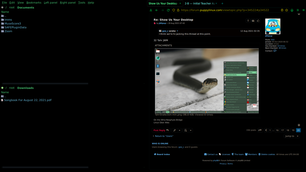
32 Tahr JWM

Attachments
TahrSnake3sm-min.png
TahrSnake3sm-min.png (98.8 KiB) Viewed 3339 times

On the Whiz-Neophyte Bridge
Linux Über Alles
Disclaimer: You may not be reading my words as posted.

geo_c
Posts: 2877
Joined: Fri Jul 31, 2020 3:37 am
Has thanked: 2197 times
Been thanked: 872 times

Re: Show Us Your Desktop

Post by geo_c »

xfe and LibreWolf super dark black code mode. Of course my desktop is black also.

Image

geo_c
Old School Hipster, and Such

User avatar
JASpup
Posts: 1653
Joined: Sun Oct 04, 2020 10:52 am
Location: U.S.A.
Has thanked: 70 times
Been thanked: 89 times

Re: Show Us Your Desktop

Post by JASpup »

That's right you're the musician.

Snazzy :ugeek:

On the Whiz-Neophyte Bridge
Linux Über Alles
Disclaimer: You may not be reading my words as posted.

User avatar
JASpup
Posts: 1653
Joined: Sun Oct 04, 2020 10:52 am
Location: U.S.A.
Has thanked: 70 times
Been thanked: 89 times

Re: Show Us Your Desktop

Post by JASpup »

Still deciphering your system...

You basically create installation packages to populate menus?

The structure I understand - launchers, menu entries, and icons.

I don't understand how an app package is needed to make the menus, despite being a handy skill.

I.e., what couldn't be done with just a script?

I'm trying to visualize the finishing steps.

I boot PUPMODE 5. I have apps (standalone/sfs/deb/pet) on a USB or internal device. What finishing steps make them active in honed X... :?:

It seems like something I can figure out but not easily conceive before experimenting.

To stay on topic, image is my regular JWM Xenial desktop. It boots burgundy but I'm in a black mood. Most desktops I post here are temporary. I 'use' this one & two XFCE, one being my first post in this thread. I have a fourth which is basically my obsolete tahr desktop that I've been booting recently for thunar (obviating the need for desktop icons or pmount).

mikewalsh wrote: Thu Jun 10, 2021 1:23 am

These "custom" Menu Entries are built from the ground up. Each one consists of a simple 'launcher' script in /root/my-applications/bin, a .desktop entry for /usr/share/applications which points to the 'launcher', and an icon that goes in /usr/share/pixmaps. (I don't like using /usr/share/icons, because you then have to provide a selection of differently sized icons each & every time. My way, you only need to provide a single one; ROX/JWM will re-size it in the necessary places. I usually create these at 256x256; the larger & more detailed the original, the less fuzzy they get at small resolutions.)

(I use a 'launcher' script in /root/my-applications/bin for the simple reason that if you want to change the location of any program/app, you only need to edit this one file; you don't need to touch the .desktop entry, since it's still pointing to this item. If you edit the .desktop file, 'fixmenus' & a restart of 'X' are required for it to show up in the Menu.)

I then use Trio's 'PetMaker' to knock up a .pet for each 'MenuEntry'.

I've attached a 'random' example below. Extract it, and study how it's put together. The same layout will work for any JWM Puppy, though you'd probably need the full, much more complex, 'standardized' .desktop entry if you're using MATE or XFCE. (A lot of the lines in a 'standardized', 'mainstream' .desktop entry simply aren't required for Puppy; these are almost always built to work with every possible variation in a given distro's full range of 'flavours', different desktops needing different command structures). You can find Trio's PetMaker here, at the old Murga forum:-

https://oldforum.puppylinux.com/viewtop ... =40457&i=1

Gives you a nice GUI to easily put together .pet packages, yet despite being built & released several years ago, it still works just as well with bang up-to-date modern Puppies as it will with really old Pups.....because its 'backend' uses the same basic built-in commands that Puppy has always used for this process (chiefly 'dir2pet', I believe). I've been using this for ages, 'cos I'm a GUI man at heart!

Attachments
xenial-desktop-52p.png
xenial-desktop-52p.png (15.83 KiB) Viewed 3291 times

On the Whiz-Neophyte Bridge
Linux Über Alles
Disclaimer: You may not be reading my words as posted.

geo_c
Posts: 2877
Joined: Fri Jul 31, 2020 3:37 am
Has thanked: 2197 times
Been thanked: 872 times

Flaticons - a new word

Post by geo_c »

Just a glimpse of the icon set I've been working on. I don't know how to make it an actual installable set or anything. But it works for me.
ImageImage

geo_c
Old School Hipster, and Such

User avatar
JASpup
Posts: 1653
Joined: Sun Oct 04, 2020 10:52 am
Location: U.S.A.
Has thanked: 70 times
Been thanked: 89 times

Re: Flaticons - a new word

Post by JASpup »

geo_c wrote: Tue Aug 24, 2021 12:41 am

I don't know how to make it an actual installable set or anything. But it works for me.

I think after creation you've completed the hard part. Icon themes from those directories:

Code: Select all

drwxr-xr-x 2 root root  729 Aug 16  2016 Ardis
drwxr-xr-x 2 root root 1046 Sep 12  2009 Blue-Moon
drwxr-xr-x 2 root root  746 Aug 10  2016 Elementary
drwxr-xr-x 2 root root  592 Dec 15  2015 StandardSvg
root# pwd
/usr/local/lib/X11/themes

X-Tahr

...are probably read from the Icon Theme changer in JWM and edit settings that are in a text file before restarting the windows manager.

That's my guess.

On the Whiz-Neophyte Bridge
Linux Über Alles
Disclaimer: You may not be reading my words as posted.

geo_c
Posts: 2877
Joined: Fri Jul 31, 2020 3:37 am
Has thanked: 2197 times
Been thanked: 872 times

Re: Show Us Your Desktop

Post by geo_c »

Hey @JASpup it worked! I put the folder in X11/themes and it appeared in the desktop icon switcher. I switched and it looks like the only snag is one of the drive icons is too big. I set most of them to 250 x 250. Which works if I just stick them in the usr/share/midi-icons directory.

But now that I checked them, the drive icons are actually 48 x 48. So I'm not sure why that one is coming out weird.

EDIT: I fixed it, but still not fully installed. Other themes aren't exchanging all the icons. Still a lot to figure out there. Another day.

@geo_c

geo_c
Old School Hipster, and Such

User avatar
bigpup
Moderator
Posts: 6975
Joined: Tue Jul 14, 2020 11:19 pm
Location: Earth, South Eastern U.S.
Has thanked: 902 times
Been thanked: 1520 times

Re: Show Us Your Desktop

Post by bigpup »

Icon theme sets are not equal.
Some have all needed icons, some do not.
If you select to use a specific one, that does not have all needed icons, you get only what it does have for icons.
Notice this one has no Puppy save or Firefox icon. Those are provided by other icons not in the icon set.

Screenshot(1).jpg
Screenshot(1).jpg (43.52 KiB) Viewed 3303 times

The things you do not tell us, are usually the clue to fixing the problem.
When I was a kid, I wanted to be older.
This is not what I expected :o

User avatar
mikewalsh
Moderator
Posts: 6148
Joined: Tue Dec 03, 2019 1:40 pm
Location: King's Lynn, UK
Has thanked: 788 times
Been thanked: 1975 times

Re: Show Us Your Desktop

Post by mikewalsh »

geo_c wrote: Tue Aug 24, 2021 4:44 am

Hey @JASpup it worked! I put the folder in X11/themes and it appeared in the desktop icon switcher. I switched and it looks like the only snag is one of the drive icons is too big. I set most of them to 250 x 250. Which works if I just stick them in the usr/share/midi-icons directory.

But now that I checked them, the drive icons are actually 48 x 48. So I'm not sure why that one is coming out weird.

EDIT: I fixed it, but still not fully installed. Other themes aren't exchanging all the icons. Still a lot to figure out there. Another day.

@geo_c

@geo_c :-

I assume you're using .png icons here, yes? (They work by far the best because of the transparency layer, which is part of the PNG specs.)

I don't know the exact reasons WHY some icons just turn out "awkward", though it boils down to what's called 'metadata'. How it was built; where it was built; what app it was built with.....what distro was the app running under when building the icon. Etc, etc.

Normally, to get an "awkward" icon behaving itself, I'll open it with the GIMP. 9 times out of 10, it'll say it's got a such & such 'profile'; do I want to convert it to a standard GIMP 'RGB' profile? I'll say 'Yes', it'll do whatever it is the GIMP does in this case, and almost invariably it behaves itself after that.....

Mike. ;)

geo_c
Posts: 2877
Joined: Fri Jul 31, 2020 3:37 am
Has thanked: 2197 times
Been thanked: 872 times

Re: Show Us Your Desktop

Post by geo_c »

@mikewalsh

Yes, that's what I did. I began the process using mtpaint, which is really a fine light weight image editor, but I finished the process in gimp, the appimage version. So I just opened up them all up in gimp and touched them up. The theme is working well. I added the icons to the Cairo Dock. Making an entire set must take half a lifetime, to really get all the icons used in a desktop environment.

Here's the desktop, and now I don't like my drive icons anymorel. I'll probably take another approach on those.

Image

geo_c
Old School Hipster, and Such

User avatar
JASpup
Posts: 1653
Joined: Sun Oct 04, 2020 10:52 am
Location: U.S.A.
Has thanked: 70 times
Been thanked: 89 times

Re: Show Us Your Desktop

Post by JASpup »

geo_c wrote: Tue Aug 24, 2021 4:56 pm

...now I don't like my drive icons anymore. I'll probably take another approach on those.

I think your drive icons look good, glow-in-the-dark version of JQBraised (if I've spelled that correctly not sure in X-Tahr without).

That's also one of the best Conkys I've seen but I've issues with Conky overall:

1. Experimenting with settings I found inconsistent data, i.e., I didn't believe what I was seeing and it changed between settings.

2. It's too much data & I can't pick and choose.

3. It's not nearly as straightforward as running task manager which almost gives me the info I want, ram & cpu strain and the benefit of task kill to boot.

I would use Conky otherwise. K.I.S.S.

Re. drive icons: They're useful for live sessions. I'm leaning towards a cleaner desktop, am distracted by desktop clutter, but in a live (PUPMODE 5) JWM session without Thunar or PCmanFM to mount and unmount partitions, we need to access to static storage media.

So every live boot sans a functioning alt-file manager I need to either use Pmount, run the Puppy Event Manager, load partition icons at boot, or get squirrelly at the terminal mounting partitions.

I did things like made a custom live boot to share between machines, or change PUPMODE between 5 & 13, and it creates all kinds of anomalies related to file access.

We need to make generic custom boots like the official releases, and the way that's making sense to me right now is loading all JWM desktop partitions, even though I'm going to spend every live session removing most of them at boot.

A file manager is a natural environment to load and unload partitions and saves a lot of hassle. THERE I only have to unselect the devices I don't want to see (accidentally mount) each boot.

On the Whiz-Neophyte Bridge
Linux Über Alles
Disclaimer: You may not be reading my words as posted.

User avatar
mikewalsh
Moderator
Posts: 6148
Joined: Tue Dec 03, 2019 1:40 pm
Location: King's Lynn, UK
Has thanked: 788 times
Been thanked: 1975 times

Re: Show Us Your Desktop

Post by mikewalsh »

@JASpup /@geo_c :-

Personally, I've never been into this whole business of themed, matching icon sets. Doesn't look right, somehow.....but, that's just me!

I've been collecting PNG icons for a great many years, sourced through literally 1000s of web-searches. Almost always I can find something I like; more recently, if I can't find just what I'm looking for, I've started collecting "blank buttons", then adding my own images to them.....making my own icons, if you like.

I will admit; it must take a fair bit of time & patience to create an entire matching set of icons, especially when you're obviously making a number of specific, "custom" ones for individual apps. I've never seen anything quite like that for Openshot, for instance!

If I'm honest, I could do something like this for myself. However, I wouldn't use either the GIMP or mtPaint (which I've never got my head round, yet). No; I would use my "go-to" image editor, first used around 13 years ago under XP.....MooiTech's PhotoScape. I've gotten SO handy with it over the years, I just know how to get ANY effect I could possibly want.

Buuuut.....as I said; I don't want to!

Horses for courses (of course.) Graphic design has been a hobby of mine for well over 40 years, ever since my schooldays.....and I get endless hours of enjoyment out of fully customising things to look exactly the way I want them to.

Mike. :D

geo_c
Posts: 2877
Joined: Fri Jul 31, 2020 3:37 am
Has thanked: 2197 times
Been thanked: 872 times

Re: Show Us Your Desktop

Post by geo_c »

mikewalsh wrote: Tue Aug 24, 2021 9:06 pm

@JASpup /@geo_c :-

Personally, I've never been into this whole business of themed, matching icon sets. Doesn't look right, somehow.....but, that's just me!

Well it's certainly an aesthetic choice. I like monochromistic concepts because they help me separate what's the system, and what's the application, file, or data. My goal here was to create icons with enough personality to tell what they are, but flat, dark, and consistent enough to fade into the scenery, while the applications and file managers jump front and center. I usually don't like icons on the desktop, but it seemed the most efficient way to launch all the portable apps I've grown so accustomed to using. At some point I may consolidate them all into a separate launch dock.

I am using dual monitors always, so this desktop image is of the primary laptop monitor, which mostly serves as a launcher/manager window. While a much larger and much better looking hdmi monitor serves as the work screen. I might open a rox window on this laptop primary monitor in the black space between concky, upper and lower launch docks, and right side icon strip. So essentially all my main work applications are one click away, while I have a quick eyeball on concky to see what fired up, or didn't, etc, and what the resource implications are. Especially handy in concky is the ability to view network traffic while zooming (which is always looking like it's on full tilt.) I still fire up the process manager a few times a day, which opens with the pc icon to the right off the shutdown icon.

I've been collecting PNG icons for a great many years, sourced through literally 1000s of web-searches. Almost always I can find something I like; more recently, if I can't find just what I'm looking for, I've started collecting "blank buttons", then adding my own images to them.....making my own icons, if you like.

I will admit; it must take a fair bit of time & patience to create an entire matching set of icons, especially when you're obviously making a number of specific, "custom" ones for individual apps. I've never seen anything quite like that for Openshot, for instance!

I simply imported most of those application icons in gimp and used the colorize function, admittedly some need a lot more fuss with contrast, chroma, etc. I even did some cutting and pasting. My favorite is slimjet, because all that is visible is the tiny jet.

If I'm honest, I could do something like this for myself. However, I wouldn't use either the GIMP or mtPaint (which I've never got my head round, yet). No; I would use my "go-to" image editor, first used around 13 years ago under XP.....MooiTech's PhotoScape. I've gotten SO handy with it over the years, I just know how to get ANY effect I could possibly want.

Gimp is mighty powerful. I used it a lot over the years. It seems to do just about anything a high-end version of photo-shop can do, with a lot less overhead. This portable fires up in about 3 seconds, which really surprised me.

geo_c
Old School Hipster, and Such

User avatar
JASpup
Posts: 1653
Joined: Sun Oct 04, 2020 10:52 am
Location: U.S.A.
Has thanked: 70 times
Been thanked: 89 times

Re: Show Us Your Desktop

Post by JASpup »

mikewalsh wrote: Tue Aug 24, 2021 9:06 pm

Personally, I've never been into this whole business of themed, matching icon sets.

It depends I think. Moka has a clean, vivid look, looks especially good in menus, but I absolutely loathe the file folder.

Blue Moon is my primary folder, but overall the theme is too... well... blue. Pick and choose.

Moblin-Stark I would put everywhere except there's not enough contrast on white.

And so on.

However, I wouldn't use either the GIMP or mtPaint (which I've never got my head round, yet). No; I would use my "go-to" image editor, first used around 13 years ago under XP.....MooiTech's PhotoScape. I've gotten SO handy with it over the years, I just know how to get ANY effect I could possibly want.

Ditto on mtPaint. It looks feature-full with a consuming learning curve. What main PhotoScape functions are you on instead of mtPaint?

On the Whiz-Neophyte Bridge
Linux Über Alles
Disclaimer: You may not be reading my words as posted.

geo_c
Posts: 2877
Joined: Fri Jul 31, 2020 3:37 am
Has thanked: 2197 times
Been thanked: 872 times

Re: Show Us Your Desktop

Post by geo_c »

JASpup wrote: Wed Aug 25, 2021 3:48 am
mikewalsh wrote: Tue Aug 24, 2021 9:06 pm

Personally, I've never been into this whole business of themed, matching icon sets.

It depends I think. Moka has a clean, vivid look, looks especially good in menus, but I absolutely loathe the file folder.

You're right @JASpup , Moka looks great in the menu. I switched to it, then back to my theme, and that gives me my geoFlaticon-Dark drive and desktop icons, with Moka in the menus.

geo_c
Old School Hipster, and Such

User avatar
JASpup
Posts: 1653
Joined: Sun Oct 04, 2020 10:52 am
Location: U.S.A.
Has thanked: 70 times
Been thanked: 89 times

Re: Show Us Your Desktop

Post by JASpup »

@geo_c We have similar visual taste, good. I spend most of my life more stranded where even with that one thing in common, there isn't anything else.

I would probably use your glow set if you feel like sharing someday.

On the Whiz-Neophyte Bridge
Linux Über Alles
Disclaimer: You may not be reading my words as posted.

User avatar
bigpup
Moderator
Posts: 6975
Joined: Tue Jul 14, 2020 11:19 pm
Location: Earth, South Eastern U.S.
Has thanked: 902 times
Been thanked: 1520 times

Re: Show Us Your Desktop

Post by bigpup »

Please get back on topic and just post images of your desktop!

The things you do not tell us, are usually the clue to fixing the problem.
When I was a kid, I wanted to be older.
This is not what I expected :o

User avatar
mikewalsh
Moderator
Posts: 6148
Joined: Tue Dec 03, 2019 1:40 pm
Location: King's Lynn, UK
Has thanked: 788 times
Been thanked: 1975 times

Re: Show Us Your Desktop

Post by mikewalsh »

@geo_c :-

Oh, I agree; the GIMP is extremely powerful.

I've been using the GIMP and Photoshop alongside each other for nearly 20 years. They're both raster graphics editors, and work in pretty much the same fashion; each has their pros & cons, yet I never understand these folks who moan about being "used" to one, and not being able to "get their work-flow" in the other. I can switch back & forth without missing a beat, but then I guess that, as the old saw would have it, familiarity does breed contempt.

I've been using PhotoScape for a good many years, nearly from its inception back in 2007. I was very pleased when I found it runs flawlessly under WINE, because it's the app that I've always used for icons & backgrounds. It has a number of features that just can't be approximated in either Photoshop or the GIMP. I was also pleased to find that the copy of Photoshop that I purchased many years ago - CS2 - is the last one that actually runs properly under WINE.

I've tried creating & making icons with the GIMP, but I've never been that happy with the results. It's perfectly true what they say; some things just work better under WINE/with Windows, whereas others cannot be beaten under Linux. I use whatever works for me, and am quite content with a mixture of the two.

Mike. ;)

Locked

Return to “Eye Candy”